
AUSTRALIA PACIFIC
IDENTITY GUIDELINES

How to bring Greenpeace’s strategy, communications and visual identity to life in the Australia Pacific region.
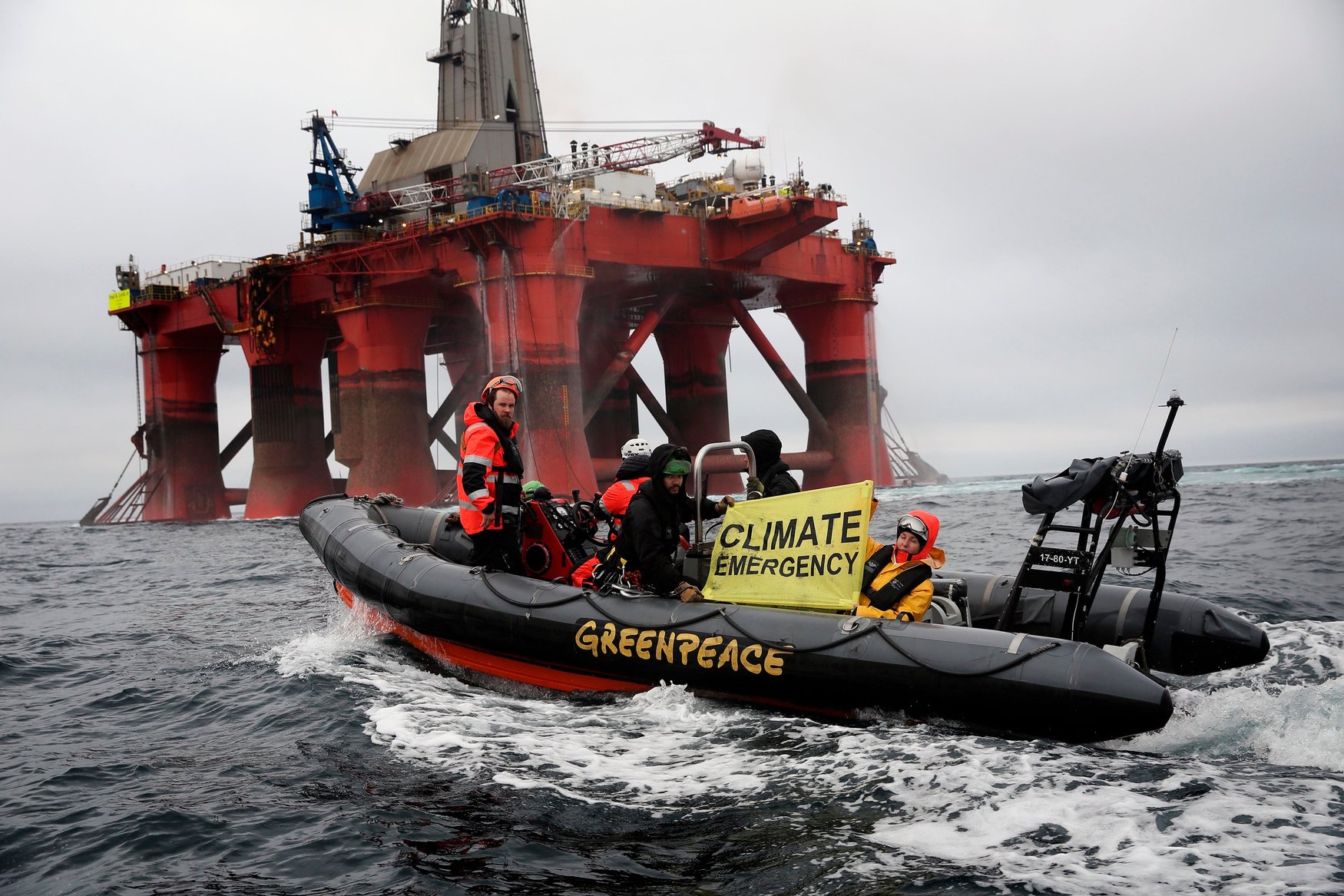
Activists on Boat alongside BP Oil Rig in the North Sea, 2019 © Greenpeace

ACKNOWLEDGEMENT OF COUNTRY
Greenpeace’s mission is to secure an earth capable of nurturing life in all of its magnificent diversity. We acknowledge the nurturing of land and waters by Indigenous peoples since time immemorial. We acknowledge the enduring sovereignty of Indigenous peoples of Australia and the Pacific. We acknowledge we stand on the traditional lands of Indigenous peoples and pay respect to elders past and present.

We are Greenpeace
And after 50 years of activism, this is what we know to be true.
There is a time for loud displays out in public,
and there is a time for talks around tables.
There is wisdom in knowing the difference, and humility in acknowledging when we judge it wrong.
Looks are almost always deceiving.
Activists don’t always look like rebels,
strategists don’t always wear suits.
The diversity of the people we serve is only matched by the people that serve the badge
of Greenpeace.
Power is dangerous when treated lightly, held tightly and wielded quickly.
We are powerful, precisely because we do none
of these things.
Trust is what guides us. Trust to speak and act in the truth, however inconvenient.
And what is that truth?
The crises that impact the future of our
planet were created by the global leaders and organisations meant to protect us.
It would be easy to sit in anger, but that’s
another thing we know to be true.
Hope and anger can live side by side. Hope, not based on ideals but on experience and action.
After 50 years of activism, these things we’ve learnt, the wisdom we’ve earned means
more than a word or a badge.
Greenpeace stands for something.
The inevitability of right over wrong.
An enduring moral code.
A force of change.
As powerful in public as behind the scenes.
We are force, built from good, built for good.
A force for good.
OUR MISSION
Greenpeace’s mission is to secure an earth capable of nurturing life in all of its magnificent diversity.
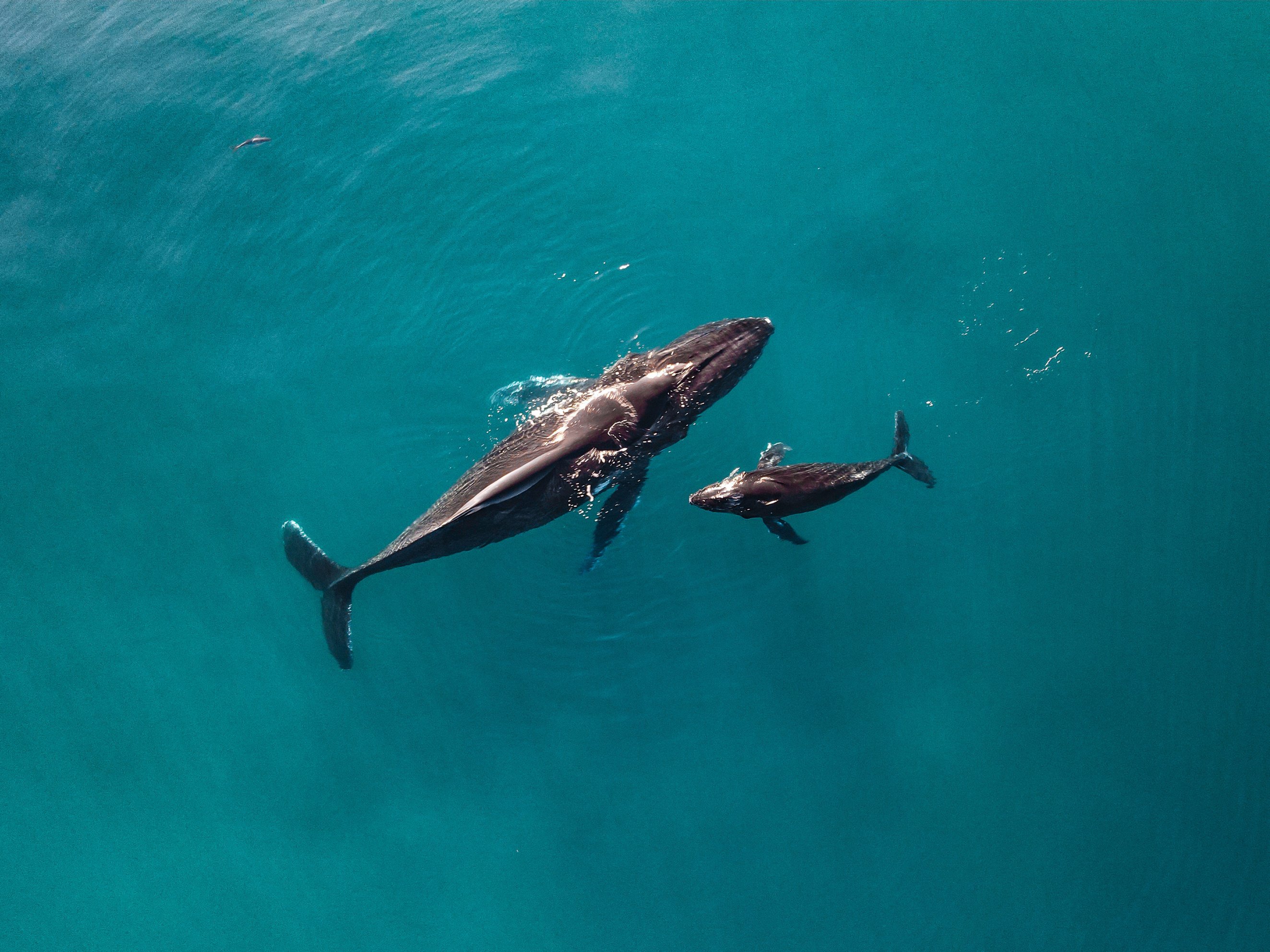
Humpback whale mother and calf swim near Ningaloo Reef, Australia, 2021 © Brooke Pyke / Greenpeace
Our purpose
Greenpeace is an independent, global environmental campaigning organisation that uses non-violent direct action to expose global environmental problems and to force solutions which are essential to a green and peaceful future.
We exist because this fragile earth deserves a voice.
It needs solutions. It needs change. It needs action.
Our vision
We want to live on a healthy, peaceful planet.
A planet where forests flourish, oceans are full of life and where once threatened animals safely roam. Where people live in balance with the natural world.
It is possible.
We can’t do it alone, but we can do it together.
Our values

Independence
We won’t compromise on the changes
our planet needs, and to ensure our independence, we do not accept money
from governments, corporations or political parties. Individual contributions, together with grants from foundations, are the only sources of our funding.

non-violence
We take action based on evidence and conscience. We are committed to peacefulness; everyone on a Greenpeace action is trained in non-violence; and we’re committed to tackling systemic discrimination, within our network and beyond.

no permanent friends or foes
If your government or company is willing to change, we will work with you to achieve your aims. Reverse course, and we will be back. What matters isn’t words, but actions.

Promoting solutions
It’s not enough for us to point the finger. Using the latest science as our base, we develop, research and promote real world steps towards a green and peaceful future for all of us.
Our history and global impact today
In 1971 a handful of determined activists leased a small fishing vessel and set sail from Vancouver for Amchitka Island in Alaska. Their mission was to protest and halt U.S. nuclear testing off the coast of Alaska with a brave act of defiance: to place themselves in harm’s way.
Despite being intercepted by the U.S. Coast Guard, these daring activists sailed into history by bringing world-wide attention to the dangers of nuclear testing. And just like that, a movement for change was started.
Today, Greenpeace alongside activists, allies, and supporters continues to make the world a better place by taking action for people and the planet. We have come together to protect biodiversity in all its forms, end all nuclear threats, phase out fossil fuels, and demand climate justice.
Over 50 years on, Greenpeace has grown from a small group of dedicated activists to a global network active in over 55 countries.
Our fight to protect our planet has grown more serious. The climate crisis, destruction of ancient forests, deterioration of our oceans, and the threat of a nuclear disaster loom large. The calls for peace and justice, and transformation of extractive, oppressive systems that hurt people and our planet are growing in urgency and strength.
Greenpeace is actively working to address these threats and leverage opportunities for change. Join us.
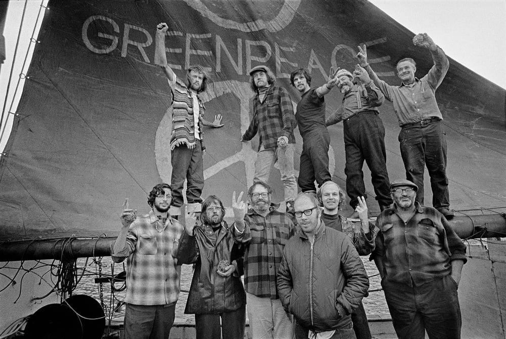
Crew of the very first Greenpeace voyage from Vancouver to Amchitka in September of 1971. Crew on-board the ship are the pioneers of the green movement who formed the original group that became Greenpeace. Clockwise from top left: Hunter, Moore, Cummings, Metcalfe, Birmingham, Cormack, Darnell, Simmons, Bohlen, Thurston, Fineberg. © Greenpeace / Robert Keziere
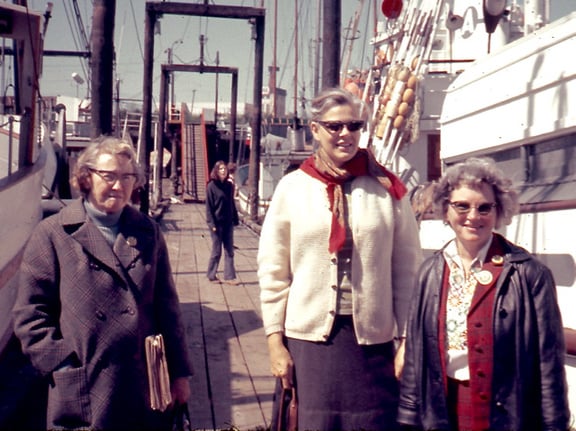
Lille d'Easum (left), Marie Bohlen (middle) and Dorothy Stowe (right) at Fisherman's Wharf in Vancouver, just prior to the departure of the first Greenpeace ship in 1971. Marie is credited with first proposing the idea of sending a protest ship to Amchitka, and all women made important contributions to the formation of Greenpeace. © Greenpeace / Robert Stowe
Greenpeace in Australia and the Pacific
How Greenpeace creates change in Australia and the Pacific
Regional context
We are in the midst of critical decades for humanity and nature. Australia makes a massive contribution to climate change as one of the world’s largest exporters of all fossil fuel emissions. Australia is also a global deforestation hotspot. The Great Ocean states of the Pacific, which have contributed so little to the global climate and nature crises face steeply worsening challenges; this also makes these nations willing to champion climate and ecology.
Our theory of change
In Australia, if we use our unique capabilities in deep collaboration with allies to clear the path of blockers and advocate clear solutions, we will catalyse systems change to enable Australia to transition away from fossil fuels and ecological destruction at emergency speed and scale.
In the Pacific, if we use our unique capabilities in deep collaboration with allies to supercharge the ability of Pacific Island nations to intervene in international governance, we will catalyse global systems change to achieve nature protection and climate justice.
Primary goal
To see that Australia steps up as leader on climate and nature protection and Pacific power to drive global change is supercharged, so we can drive the necessary change at emergency speed and scale, to secure the conditions for the flourishing of life on Earth.
Our campaigns
The choice and design of our campaigns reflects the optimal role for Greenpeace within the Australia Pacific region. Together, with allies and our supporters, we are working to:
- Halt the most climate polluting project proposed in Australia and to shift the country to becoming a renewable energy superpower.
- End the age of the external combustion engine in Australia.
- Supercharge the unique power of Pacific Island nations and communities to change the law of the world.
- End deforestation in Australia.
- Support global oceans ambition for an end to Deep Sea Mining, the creation of an Ocean Plastics Treaty, and the operationalising of the High Seas Treaty.

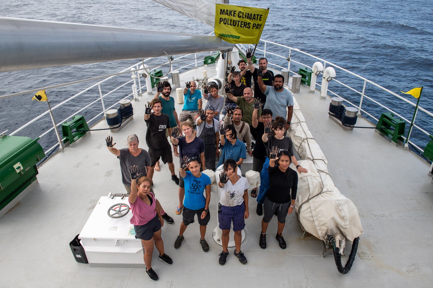
Rainbow Warrior crew call for climate justice ahead of the UN Climate Change Conference (COP28), 2023. © Chris J Ratcliffe / Greenpeace
INTRODUCTION
Purpose of these local guidelines
We are one Greenpeace: One united, global voice.
But the Greenpeace brand, our campaigns and other work that makes up what we do and how we do it, can resonate differently with audiences across the globe influenced by local cultures and contexts.
These guidelines have been developed for Greenpeace Australia Pacific and informed by local insights and strategy so that we can best engage audiences in Australia and the Pacific in our local and global work.
Everyone who communicates or acts on behalf of Greenpeace Australia Pacific should read and adopt these guidelines.
No matter your audience (supporters and donors, the general public, government, the media, allies, volunteers and staff) or your communication platform (online, in real life, on the phone), use these guidelines to create meaningful engagements and experiences that are uniquely Greenpeace. Aka ‘on brand’.
OUR STRATEGY
The need for a localised brand strategy
The Greenpeace Australia Pacific brand strategy is shaped by our local campaigning and fundraising needs, audience insights and other environmental factors including the media landscape, local comparators and political context.
An overview of the brand strategy and key takeouts is presented in these guidelines.
For more background and depth on the brand strategy, reach out to your Greenpeace AP contact.

Drive knowledge
Elevate the Greenpeace brand beyond the sum
of our campaigns.
The Role of Our Brand

CREATE CONNECTION
Humanise our work by sharing the highs and lows of the journey along the way.

INCREASE RELEVANCE
Modernise our founding spirit to reflect all that we are and must be today
Strategy overview
Our brand strategy is the distillation of what makes us unique and informs everything; from the causes we take on, the methods we use, who we recruit and how we look, sound and act externally.
brand insight
The nature and climate crisis was created by global leaders and organisations that were meant to protect us. We need a leading global organisation like Greenpeace to fix it.
The Opportunity space
Greenpeace acts as a force for good, delivering hope by leading the journey of activism – living the highs and lows with our supporters.
The role for Greenpeace
To deliver hope that our natural world will thrive in all its glory through the belief in the power of Greenpeace and the collective strength and strategic action of those that rally around the brand.

What sets us apart
- Accountability is placed only where it belongs.
- Beside anger there must always be hope.
- Trust is our currency, truth is how we keep it.
- Daring acts are strengthened by strategic influence.
INTERNAL FACING brand idea
THE FORCE FOR GOOD.


The Force
- Strategic strength
- Influence
- People power
- A collective
For Good
- Sustainable
- Moral
- Integrity
- Humility
Our force is not always seen, but always strategic and present
We are For Good (ethical) and For Good (enduring and everlasting).
Allowing hope to come to life along the journey through the strength of Greenpeace and the power of the collective that rally behind the brand.
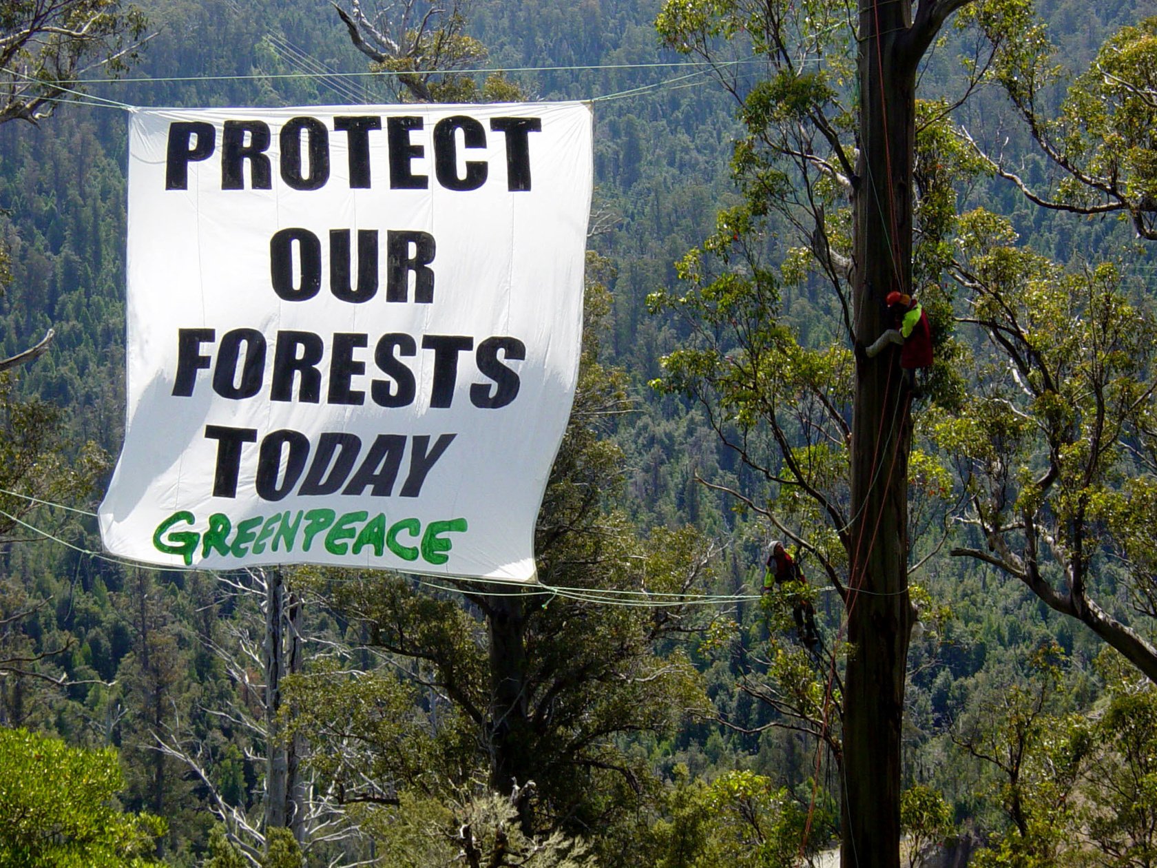
Greenpeace and Wilderness Society activists hang banners during their 3 month tree sit at the Styx Valley, Tasmania, 2004. © Greenpeace
Strategic
communications
How we bring the strategy to life with our language and tone of voice.
Strategic messaging
When creating messaging, it is important to understand the distinction between
the message we’re trying to convey to our audience and how we want communicate it.
What we say
The key themes of our story — what we want to communicate to advance our brand strategy and value proposition with our stakeholders.
CONFRONTATION
INDEPENDENCE
STRATEGIC INFLUENCE
LEADERSHIP
HOPE
How we say it
The unique way we communicate — how we communicate the support our brand image and stand out in the marketplace.
RESOLUTE
STRIKING
HOPEFUL


Our voice traits
Our brand idea “The Force for Good” comes to life through our tone of voice in three distinct traits:
RESOLUTE
As the climate movement has evolved, so has Greenpeace Australia Pacific. Today, our rally cry is often accompanied by a strategic conversation. But some things haven’t changed, and we’ll never forget how we got here. We’re strategic, solutions-focused, and know how to be heard.
Just because we can don suits and meet with CEOs, doesn’t mean we won’t scale their building to hang banners across the windows of their corner office.
We mean what we say. We’re confident in our convictions. We’ll negotiate,
but we’ll never back down. We persuade, but we’re not afraid to be brave. We’re deeply passionate, unapologetically bold, and strengthened by our
past achievements and future direction.
We are Greenpeace Australia Pacific.
STRIKING
Words are powerful tools, and how we use them must be impeccable.
We are leaders. We are the Force for Good, and we wield the force as often and as proudly as we define the good.
Our ideas are articulated in such a way that they strike right to the heart of the matter, and right to the hearts of those who matter in our fight.
These are statements and headlines that are often short. Often punchy. Always impactful. Who could forget Greta Thunberg’s striking ‘How dare you?’
The climate space is cluttered with activism, fundraising and storytelling. Let us be crystal clear with our message. Less can be infinitely more powerful than more.
HOPEFUL
We are facing an unprecedented emergency threatening people
and the planet alike.
But we must remember that we still have the power and agency to change our course. We have hope. We know both the causes of and the solution to, the climate crisis.
Whether we’re activists, donors, supporters or citizens, we are united by the idea that our world and its inhabitants are worth protecting.
Through our tone of voice, hope is action. Solutions based. Future focused. Achieved by us, a collective.
Everything we say must include a solution and call to action that is understandable, realistic, and motivating. And which brings people with us, so we can be hopeful, together.

Tone guide
What tone scale are we aiming for?

BOLD
Be bold, brave & confronting
URGENT
Sound the alarm on reality
personal
Show Greenpeace’s human side
hopefuly & Playful
Have some fun and inspire
HONEST & truthful
Always fact-based & credit appropriately
aggressive
Never lose your cool
NEGATIVE
Inspire, not despair

CONFUSING
Keep it simple and to the point
condescending
Be respectful & avoid talking down
ignorant
Know what you’re talking about
Tone guide
What tone scale are we aiming for?
TOO SOFT
We can’t just sit back and watch heartless corporate villains destroy our precious marine life. It breaks our hearts seeing what Woodside is planning to do to the Scott Reef.
The children of the Pacific are counting on you to protect them from the fossil fuel industry. They are watching their hopes and dreams wash away with the rising tide. Don’t let them lose hope 💔
Our oceans are dying. They need your help before it’s too late - don’t you want your children to see beautiful dolphins and whales?
Just picture it: a baby koala, torn from her mother’s arms while their homes are destroyed… all to make your burger.
SWEET SPOT
Who could knowingly trash our oceans? Woodside, one of the biggest oil and gas companies in the world, it turns out. It’s making a move on Western Australia’s coastline, and it’s the marine life and beautiful coastlines that will pay with their lives for profit.
We’ve just found out there are 600 fossil fuel lobbyists at COP this year. They’re trying to weaken global climate agreements. Can you chip in to send Pacific climate advocates to help make sure climate justice is on the table?
The fossil fuel industry is trashing our oceans through plastic, oil and gas mining, and climate change. But with you, we can turn the tide on this destructive industry.
Australia is a global deforestation hotspot. Shocked? So were we. But here’s how you can help.
TOO NEGATIVE
Woodside - you’ll pay for this! You and your corporate cronies better watch your backs. Nobody trashes the oceans on our watch 👊
Evil fossil fuel lobbyists are swarming the world’s biggest climate conference. We’re gonna fight back and make sure they can’t do their dirty work.
BREAKING: the Great Pacific Garbage Patch has doubled in size 😱 Just when we thought our oceans couldn’t get any sicker!
McDonalds has BLOOD on its hands. It’s killing koalas for burgers and we are not gonna stand for it!
Do’s and Don’ts
Here are some general guidelines for the tone we want to convey with our verbal communications.
The do’s are applied according to context but the dont’s are to be avoided always.
DO
In most cases, try leading with the positive, the action or the benefit - or introduce it quickly.
Be single-minded with your message and crystal clear with calls to action. What do we want people to do, and does the rest of the post explain why?
Ask questions to provoke thought, but…
Connect with people you’re responding to with the energy they meet you with (though of course, never be rude). If they’re serious, don’t try and joke. If they throw you a little joke, feel free to respond the same way and then move on.
Keep it in plain English, human-sounding and
conversational for the most part.
DON’T
Be too fluffy and sweet, or too gloom and doom. We’re confident, resolute leaders.
Add PS: (it looks like an afterthought), and try to be specific. “Help now!” is vague, but “Sign our petition!” is clear.
(Don’t) …ask too many. We want to capture attention, but we want to avoid overwhelming people and distracting from our purpose.
Be too ‘matey’ or overly familiar with people.
We also don’t want to be inflammatory - we want to recognise the passion and gently help them see hope through our action(s) - even if they don’t feel it.
Try to sound ‘intelligent’ - don’t use a longer word when a shorter word will do.
Tips for bringing our tone of voice to life
First Person
Speaking from the first person experience is a great way to connect. While we should always refer to Greenpeace Australia Pacific in the first instance in longer writing, switch to we, us and our after.
Compelling Headlines
Compelling headlines are always
a great way to catch attention and bring that ‘striking’ trait to life. Keep them short, and powerful, sum up your main point. (Subheadings can help capture more info)
Limit Repetition
Don’t repeat yourself too often. Make a point and give
it room to breathe. If we jam too much copy into an email, social post or web copy, people will start skimming your copy and lose interest.
Contractions
Always use contractions.
‘We’re’ instead of ‘we are’. ‘They’ll’ instead of ‘they will’, etc. Don’t worry - you are still professional even if you implement these into your copy.
LIMIT COPY
Cut your copy. Not entirely, of course, but once you’ve written it, see how much you can lose *without* losing the humanity. Clarity = cut-through, which is super important in a crowded NGO space (especially in climate).
CONFIDENCE
Lead with confidence. We are leaders in this space and people look to us to speak with conviction. We aren’t afraid to make strong statements, though we’re never aggressive in doing so.
Talking about Greenpeace
We and our
In supporter facing communications, we use a personal tone to create a genuine sense of ‘to’ and ‘from’. You can refer to Greenpeace using first-person pronouns, such as ‘we’ and ‘our’.
DIFFERENTIATE
Use ‘Greenpeace Australia Pacific’ if differentiating from another NRO or Greenpeace International. Always refer to our full NRO name in media releases. The exception is the heading where you can refer to just ‘Greenpeace’ provided the body copy uses the full name.
WHO is Greenpeace
In public-facing communications, only staff who have been media trained may appear as a Greenpeace spokesperson or representative. We love our crew, but they should be referred to as Greenpeace volunteers or activists.
Don’t forget the Pacific
Always remember we are one NRO and that the climate crisis has no borders. Avoid just referring to Australians or the Australian impacts of climate change, but loop in the Head of Pacific accordingly on language specifics when including the Pacific.
jargon shmargon
Don’t use internal jargon or acronyms. This includes GPAP, GPI, NRO, etc.
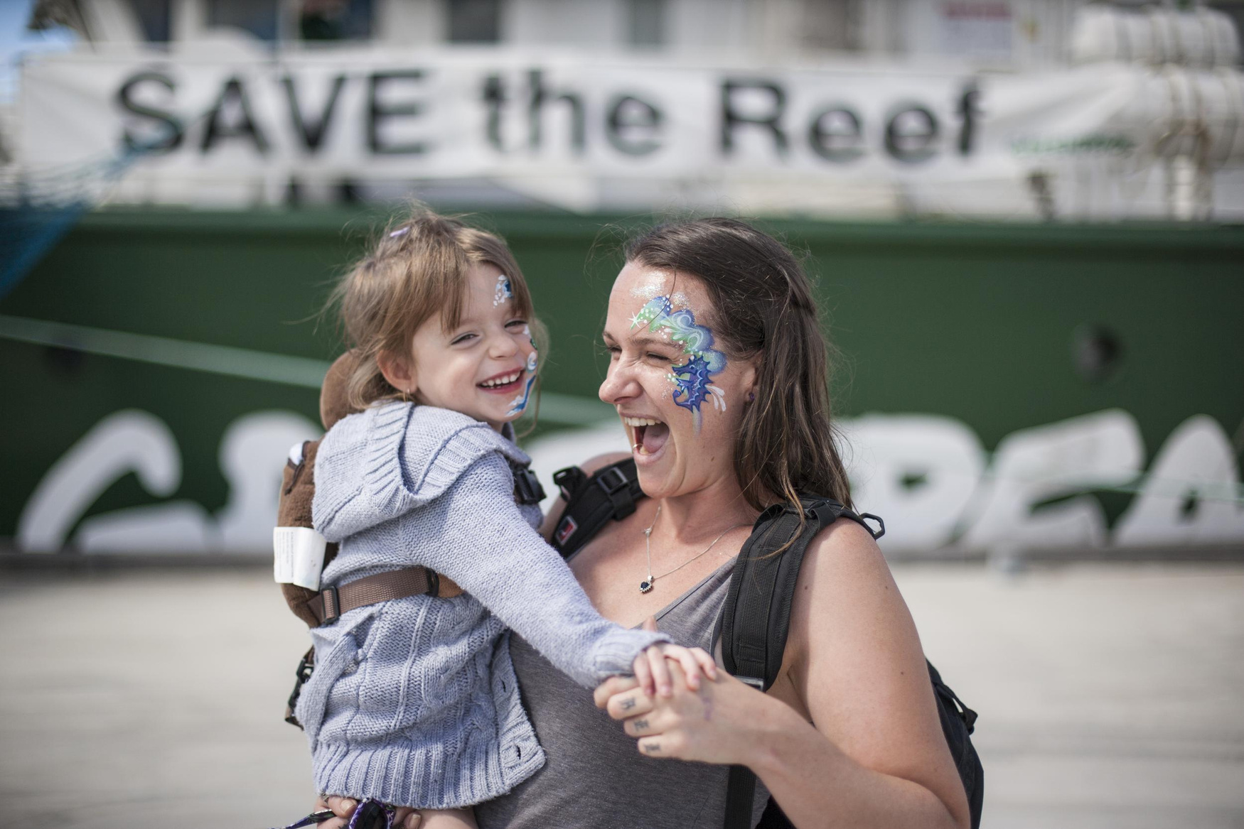
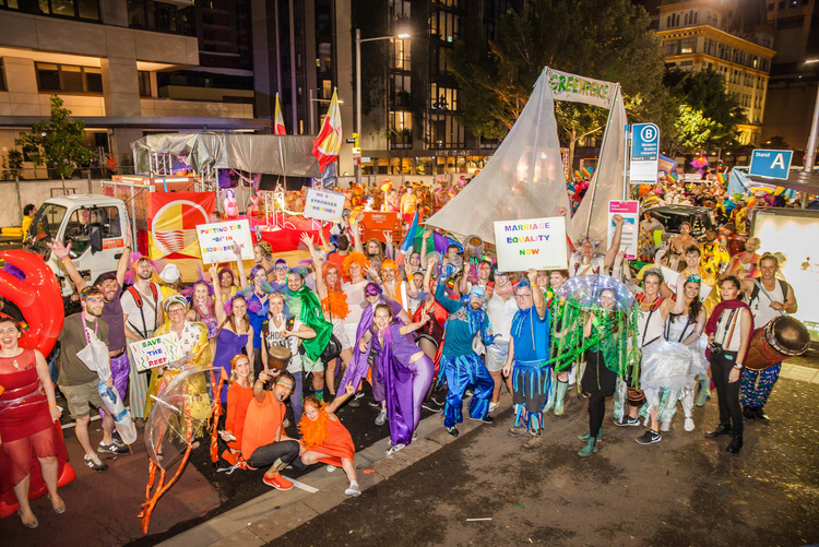
Visitors at a Rainbow Warrior 'Open Boat' day in Melbourne, to show support for the 'Save the Reef' campaign, 2013. © Rodney Dekker / Greenpeace
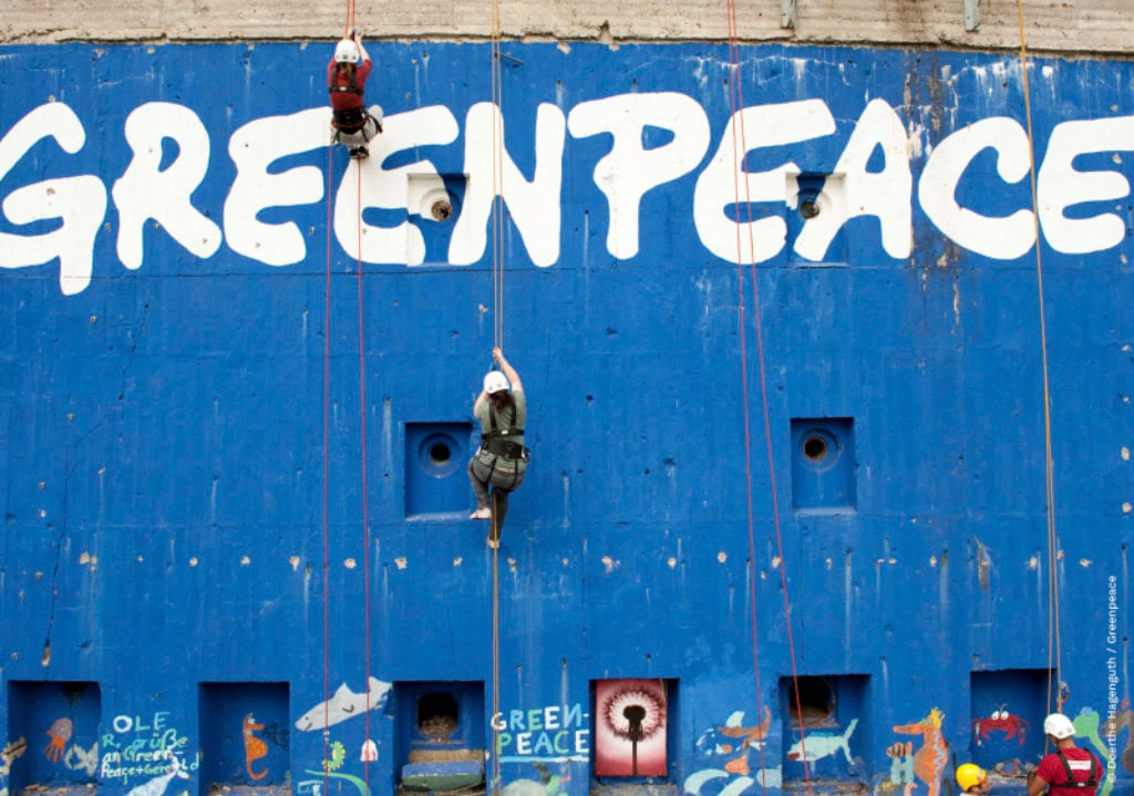
VISUAL IDENTITY
These visual elements articulate ‘The Force for Good’ through the idea of our foundations being built on good, both geographically and symbolically.
These region-specific guidelines build on the Greenpeace Global Visual Identity Guidelines, retaining key fundamentals such as the logo, Greenpeace green and typography. We’ve introduced some additional elements that allow for flexibility in tone, while carrying confidence, optimism and urgency.
Identity recognition scale
Different contexts may require different levels of identity recognition.
Use this scale to determine which identity elements can be used to achieve the appropriate level of brand recognition. The more elements used the greater the level of brand recognition.
GP LOGO + GP GREEN + GP FONTS
3
GP LOGO + GP GREEN
2
GP LOGO
Clearly including our logo on all our work means that Greenpeace is recognised
1
Any other identity elements without the logo are unlikely to provide sufficient brand recognition
NO GP LOGO
0
NO GP LOGO + NO IDENTITY ELEMENTS
Creating work that doesn’t clearly include our logo or other identity elements makes it extremely difficult for audiences to recognise that it is a Greenpeace product
-1
It is not advised to leave out the logo in our communications. See Logo Use - Exceptions for more details.
LOGO
Logo history
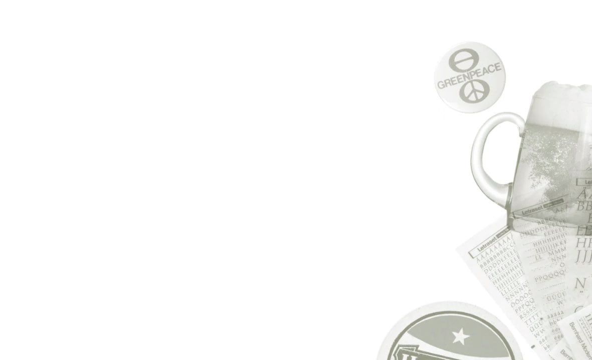
When Greenpeace International began in the late 1970s there was no agreed way to write (or even capitalise) ‘Greenpeace.’ Some adopted and adapted the Sisiutl symbol while others used a peace sign and the ecology icon with “Green Peace” as two words. It would often be set in whatever typeface someone favoured that week – depending on which Letraset sheets were lying around the office or ship.
Rémi Parmentier, one of the founders of Greenpeace International, recalls: “One day in Paris in the early 80s, we were out of Letraset sheets and the local stationery shop was closed. A publication needed a Greenpeace logo.
So a fellow named Jean-Marc Pias, who had been making posters and stickers, ran around the corner to a bar and asked an artist friend named Patrick Garaude to write out “Greenpeace” for him.” Garaude drew quickly with a fat felt-tip pen, on a beer mat, and the “graffiti logo” was born.
Rémi says: “Whenever I see that logo today, especially in remote places like Antarctica and the Amazon, I remember Garaude with a pen in one hand, and a beer in the other.”
Patrick Garaude’s logo has since been adapted for modern print and digital use, but retains its ‘felt-tip pen’, imperfect quality. This hand-drawn look is a key identifier of Greenpeace’s legacy and anchors our visual identity in the network’s grass root beginnings.
The logo
The Greenpeace logo is a ‘signature’, not just because it was originally signed by hand, but because it works as an identifier and a signifier of accountability.
It proudly lets the world know who we are and that we take responsibility for what we do. Everything the Greenpeace network does should be ‘signed off’ with the logo (with a few noted exceptions).
The Greenpeace logo is an important asset of the organisation, providing a legal trademark and guarantee of quality and integrity. Using the same logo serves to strengthen our messaging: we are united and we have one voice.

This is the official registered Greenpeace logo. The full set of logo formats and colours are available to download from the Greenpeace media library here.
*Be sure to use the CMYK versions for print purposes only.
Logo colour
The logo should be coloured Greenpeace Green or black for light backgrounds. For dark backgrounds, use Greenpeace Green or white.
The logo should never appear in any other colour. Always ensure good contrast between the logo and background colours.


Black
Greenpeace Green
White
Variations to the logo
regional office variations
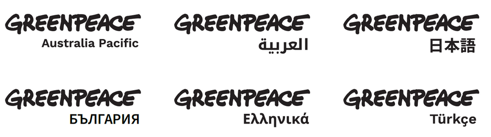
Generally, the Greenpeace logo should appear on its own. However, when region/office-specific variations are required for legal reasons or to differentiate from another Greenpeace office, the logo should be appended with the NRO name, aligned right or left in Work Sans. The Greenpeace logo should always remain visually dominant.
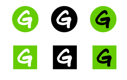
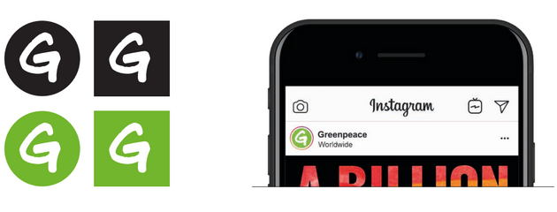
Favicon / Social Media Monogram
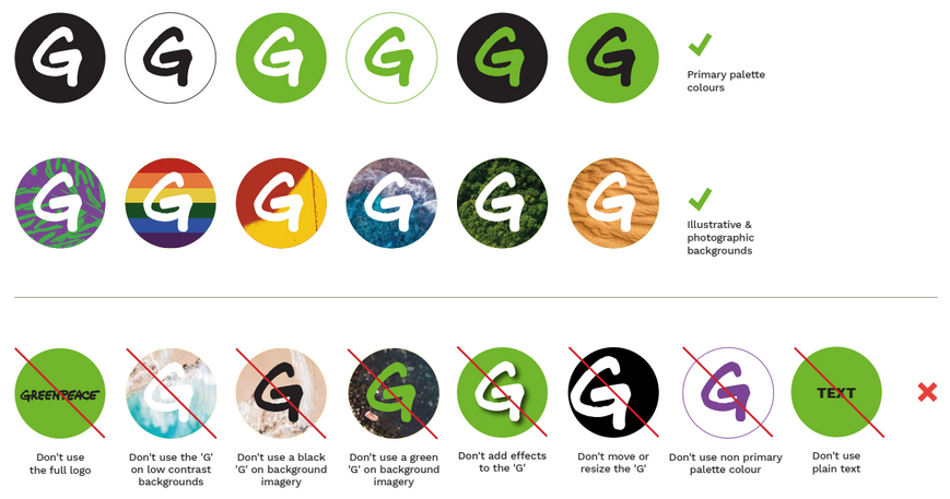
To ensure consistency, correct placement and ease of recognition, the Favicon / Social Media Monogram should primarily use the Masterbrand colours – see examples at right.
Custom backgrounds can be used to allow a unique expression, on occasion, but should generally be kept to a white ‘G’ on a green background.
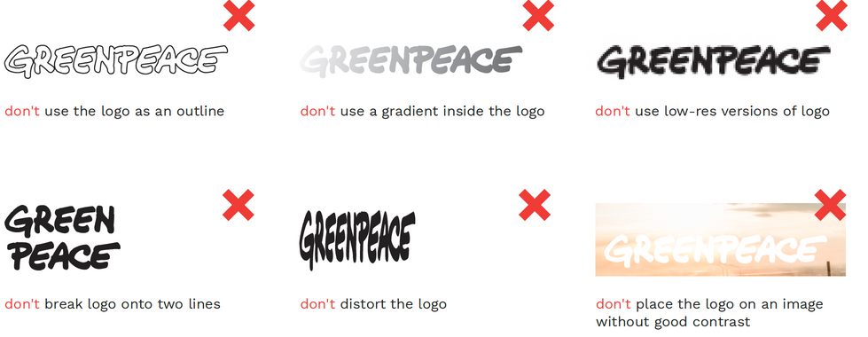
Improper use of the logo
As a global organisation, we should present a consistent and unified public face. Consistent use of the logo helps to reinforce our identity and avoids confusion.
Always use the official logo files and don’t alter them in any way. (See here, for exceptions)
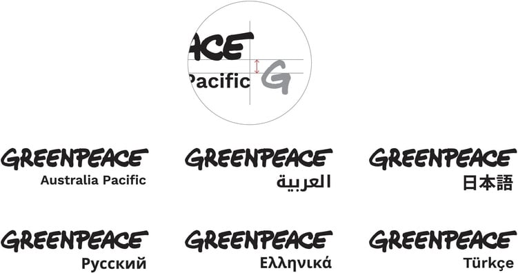
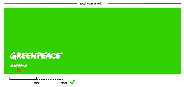
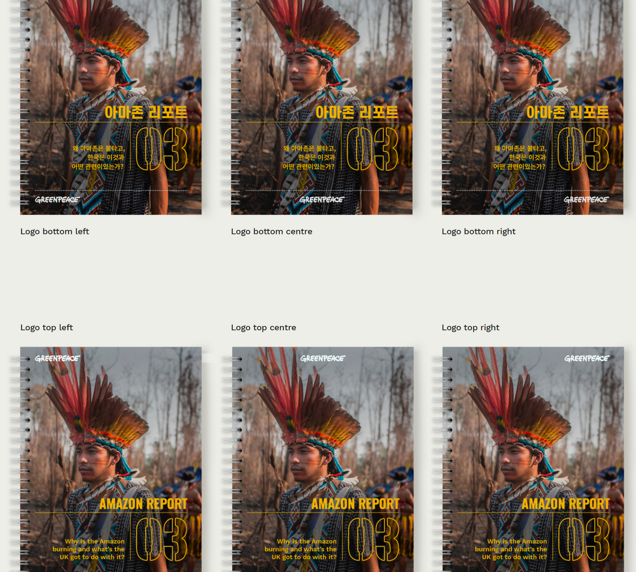
Logo size, position & clearspace
SIZING
Depending on the dimensions and aspect ratio of the canvas, the logo should be between 15% and 30% of the total page width.
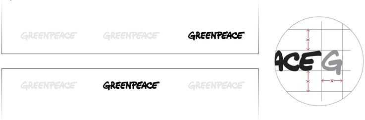
POSITION
In most cases the logo should be ‘signed’ along the top or bottom edge, and aligned left, right, or centrally. The choice of logo position should relate to the other visual elements and reinforce the overall composition.
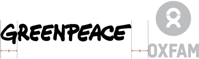
CLEARSPACE
The logo should always have clearspace around it, defined by the depth of the Greenpeace ‘G’ - the example shows the minimum clearspace required.
Partner logos
The placement and size of the Greenpeace logo in relation to partners’ logos will depend on the nature of the partnership.
The lead partner’s logo will be optically larger, but in equal partnership, the logos will be visually the same.
When multiple organisations' logos are to be displayed together, be sure to leave enough clear space between the logos. This clear zone should always be applied to the logo.

Partner logos on event invitation
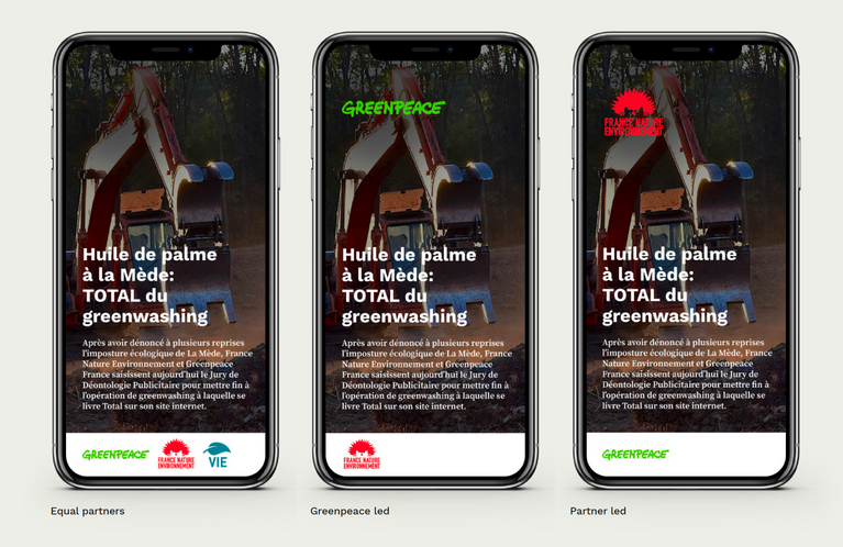
Equal partners
Greenpeace led
Partner led
Logo usage - exceptions
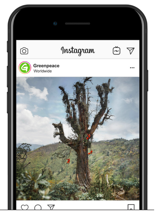
Where there is already sufficient context (ie. editorial photography or social media posts where our brand name is already clearly stated), the logo does not need to be embedded in Greenpeace imagery.
In this example, the the profile image and the words 'Greenpeace' appear in direct proximity to the image.
When images are designed to be re-shared then it is advisable to include the Greenpeace logo for recognition and accountability.
Logo as a creative asset
Sometimes the logo can be used as a creative asset. This is most relevant when it is illustrating an internal document or the subject is Greenpeace itself, including annual reports, business cards, membership promotion, internal reports, etc.
This application does not replace the use of the signature logo, which should always be used. The signature logo and its illustrative version typically should be very different in scale, with the illustration being significantly larger.
Cropped logo used as illustration
Signature logo
COLOURS

Brand colours
Colours are a distinct expression of Greenpeace’s personality. “Greenpeace Green” (#66cc00) is one of our most recognisable identity features. It is most commonly used in the logo and features prominently as an emphasis colour in both our print and digital communications. It is not essential that you use this colour in all of your communications, but be aware that the logo should only ever appear in this green, black or white. Consistent use of our core colours helps to maintain our brand presence and inject energy and depth into our storytelling methods.
In corporate/general branded collateral, Greenpeace Green should be used sparingly as an accent colour, eg for logo and as a graphic element. In social media it can be used more amply - as headers, fields of colour, a Call To Action button, and in combination with our Secondary Colours.
Primary colours
Greenpeace Green is our primary display colour. It is one of our most distinguishing identity features.
It can be used to emphasise and highlight, but not for standard text.
It is not WCAG AA (web use) rated for text on light backgrounds and should be applied selectively.
A similar colour cannot substitute for Greenpeace Green. Don't specify PMS when printing digital (use CMYK mix) and never rely on software's default CMYK conversion.
GREENPEACE
GREEN
WEB
66CC00
RGB
102 204 000
PMS
376 C
382 U
CMYK
55 0 100 0 C
35 0 100 0 U

BLACK
WEB
000000
RGB
000 000 000
PMS
Black
CMYK
0 0 0 100
WCAG AA
small text
large text


WHITE
WEB
FFFFFF
RGB
255 255 255
CMYK
0 0 0 0
Colour variations
GREENPEACE
GREEN
WEB
66CC00
RGB
102 204 000
PMS
376 C
382 U
CMYK
55 0 100 0 C
35 0 100 0 U
GREENPEACE GREEN - TONAL VARIATIONS
This palette may be used within all brand applications such as:
- internal or external facing documents
- printed or digital brand collateral
It is used as a decorative colour when when we want to emphasising the brand, to highlight key information and complement the core Greenpeace Green.
DARK GREEN
Dark Green can be used when Greenpeace Green isn’t appropriate due to accessibility requirements. It is WCAG AA rated for both large and small text. Dark Green works great as a background colour with white text.
GREENPEACE
GREEN - 50%
WEB
b2e57f
RGB
178 229 127
PMS
366 C
366 U
CMYK
37 0 62 0
GREENPEACE
GREEN - 25%
WEB
d8f2bf
RGB
216 242 191
PMS
580 C
580 U
CMYK
20 0 43 0
DARK
GREEN
WEB
004B00
RGB
000 075 000
PMS
342 C & U
CMYK
100 0 100 71
WCAG AA
small text
large text
Secondary colours
Occasionally, we introduce other colours into our palette to add personality, emotion and depth to our work. The Greenpeace Identity Recognition Scale must be considered before using non-primary colours - ie; the Greenpeace must be clearly visible, with the Greenpeace fonts used.
choosing the right supporting colours
The choice of supporting colours will largely depend on context and are selected on project-by-project basis to maintain flexibility and appropriateness. We don’t introduce new colour palettes specific to campaigns, unless we are creating a parody under a brand attack. We use the power of imagery to bring further colour and movement into our visual communications.
As a general rule:
• Choose colours that reflect the subject matter
(eg; blue for ocean-themed work)
• Choose colours that reflect the tone of the communication
(eg; yellow to express urgency)
• If pairing with Greenpeace Green, ensure the colours complement the primary pallet
• Avoid using too many supporting colours in one design
(1-3 colours is a good range)
• Ensure enough contrast between colours, text and background to meet accessibility standards
Greenpeace activists hang a banner at Australia’s Parliament House, 2018.
© Sean Davey / Greenpeace
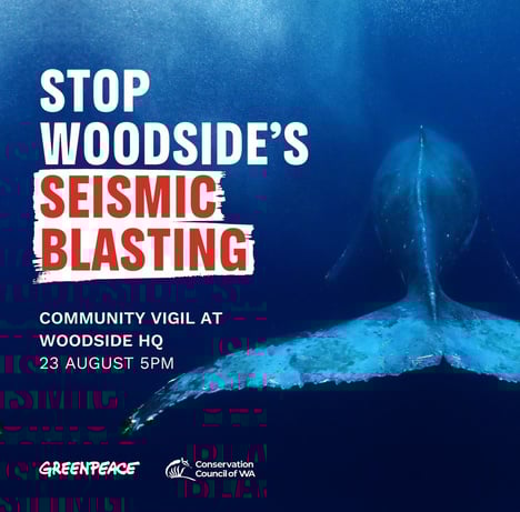
Social media posts use the Volcano Red to express urgent or shocking facts.
ACTION YELLOW
Our iconic yellow campaign banners have been used in non-violent direct actions for more than 40 years. Action Yellow is used for banners and protest signs, items that are a call to action (such as buttons on the website), or for special highlighting. It is not WCAG AA (web use) rated for text on light backgrounds and should be applied selectively. Always use black text for legibility.
VOLCANO RED
Volcano Red can be used when expressing a sense of danger, opposition or urgency. It is commonly used alongside more negatively-toned “Breaking News” social posts or to call out a company, industry or figure that Greenpeace is campaigning against. Use sparingly.
If using with text, always check for legibility - opt for white text on red background, or red text on white background.
ACTION YELLOW
WEB
F7E302
RGB
247 227 2
PMS
PRO. YELLOW C & U
CMYK
5, 4, 100, 0
Pair Action Yellow with black text.
VOLCANO RED
WEB
D52E27
RGB
210 33 22
PMS
485 C & U
CMYK
10 96 99 2
Pair Volcano Red with white text.
OCEAN
Typically used for oceans-related content, when Greenpeace Green clashes with the design. Use sparingly.
SEAFOAM
Used as an accent colour to Ocean Blue, for oceans-related content, when Greenpeace Green clashes with the design. Use sparingly.
ochre
Ochre can be used for hyperlinks within text, sparingly.
OCEAN
WEB
3833CA
RGB
56 51 202
PMS BLUE
2736 C
072 U
CMYK
90 78 0 0
SEAFOAM
WEB
9eE0fB
RGB
158 223 250
PMS
2975 C
2975 U
CMYK
40 0 2 0
OCHRE
WEB
F4620D
RGB
244 98 13
PMS
165 C
3564 U
CMYK
0 60 95 4
A note on colour
Colours vary across computer/ tablet/ phone screens and as such may not be a true representation of the colour. It is strongly recommended that a print colour proofing test be carried out to ensure accuracy when reproducing these colours. You can check for colour accessibility at colourcontrast.cc
Colour & accessibility
Employing accessibility best practices, by ensuring there is enough contrast between text and its background colour, improves the user experience for all viewers. See a guide below, and use the Accessible Colour Palette Builder to check your design for accessibility,
White text
Black background
Aa
Green background
Green text
Aa
Black text
Aa
Useful Tips:
To use text over images, add a solid background behind the text or a dark overlay to the image. See details here.
Don’t use colour alone to convey meaning. Use icons, written content, and other visual elements to reinforce clear communication of the content.
White background
Aa
As a rule of thumb, don't use these colour combinations as they do not meet a colour contrast ratio of 4.5:1, meaning that they do not conform with the accessibility standards for body text. This means that some people would have difficulty reading the text. Green text on white background, or white text on Green background, may be used with thick fonts. Use sparingly, such as for headings.

Don't set small text in Green on white backgrounds

Dark green + supporting highlight colour
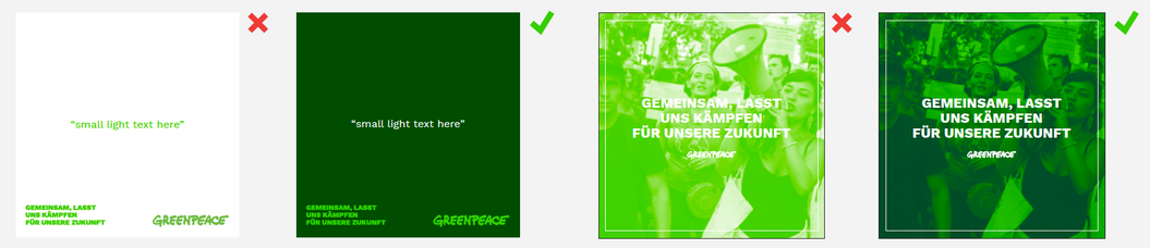
For small and/or light text, don’t use green on white
Use white for small text and choose a darker background
Don't set body text in white on green backgrounds
Body text black on green
Don't use white on green mono images
Use darker colour for duotone image.
typography
Typography
Our primary typefaces are for use throughout all Greenpeace communication pieces. All typefaces are open source and can be adapted and expanded depending on need and circumstance. This approach combines our design strategies of being open, participatory, and flexible.
FAMILY
Greenpeace Sans
Work Sans
STYLES
1 weight, upper/lower case
Regular
SemiBold
ExtraBold
Italic
SemiBold Italic
ExtraBold Italic
USAGE GUIDANCE
Display
Headings
Pull-out quotes
Subheadings
Body copy
Hyperlinks and CTAs
how to install fonts TO YOUR COMPUTER
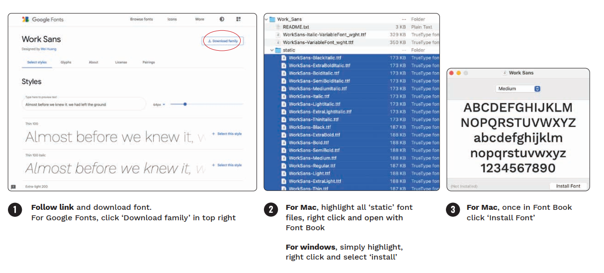
2. For Mac,
highlight all ‘static’ font files, right click and open with Font Book
For Windows,
simply highlight, right click and select ‘install’
3. For Mac
Once in Font Book click ‘Install Font’
Aa
GREENPEACE SANS IS OUR PRIMARY DISPLAY TYPEFACE
Typography - Greenpeace Sans
‘Greenpeace Sans’ is a display typeface designed especially for Greenpeace, inspired by the distinctive forms of the inflatable boats used by activists ever since our 1970’s confrontations with Russian whaling ships.
Greenpeace Sans is our most distinctive typeface, and used as a display font for titles, headings, pull-out quotes and on banners. Please refer to Usage Examples for further detail.
In rare instances where Greenpeace Sans is not available for use (eg; Google/Microsoft Suite) - the typeface ‘Oswald Bold’ may be used as an alternate font.
Aa
Work Sans is our secondary typeface
Typography - Work Sans
Work Sans is a sans-serif typeface family that is influenced
by early Grotesques. The Regular and SemiBold weights are optimised for on-screen text usage at medium-sizes (14px-48px) and can also be used in print design. The fonts closer to the extreme weights are designed more for display use, and should be used sparingly.
Work Sans is our secondary typeface. It is not as unique as ‘Greenpeace Sans’ but pairs well with it and is highly versatile. Use Work Sans for subtitles, body copy, for links and call-to-action. Please refer to Usage Examples for further detail.
TYPOGRAPHY - system fonts
Some systems or devices are limited to a small default suite of fonts - that can be accessed from all computers worldwide - meaning that our brand typefaces are not available to use. System fonts should ONLY be used to replace primary fonts when creating collateral that can only be built in that program or system: eg; Office programs (Microsoft Word, PowerPoint or Excel), and in online communications such as email.
Headlines should use Oswald Bold (and if unavailable, Impact) in uppercase, and text and subheads should use Arial Regular and Bold.

Using other typefaces
Personality fonts may be introduced in addition to the primary brand fonts to help further illustrate specific content (eg; a handwritten font) or when spoofing an organisation to undermine its brand.
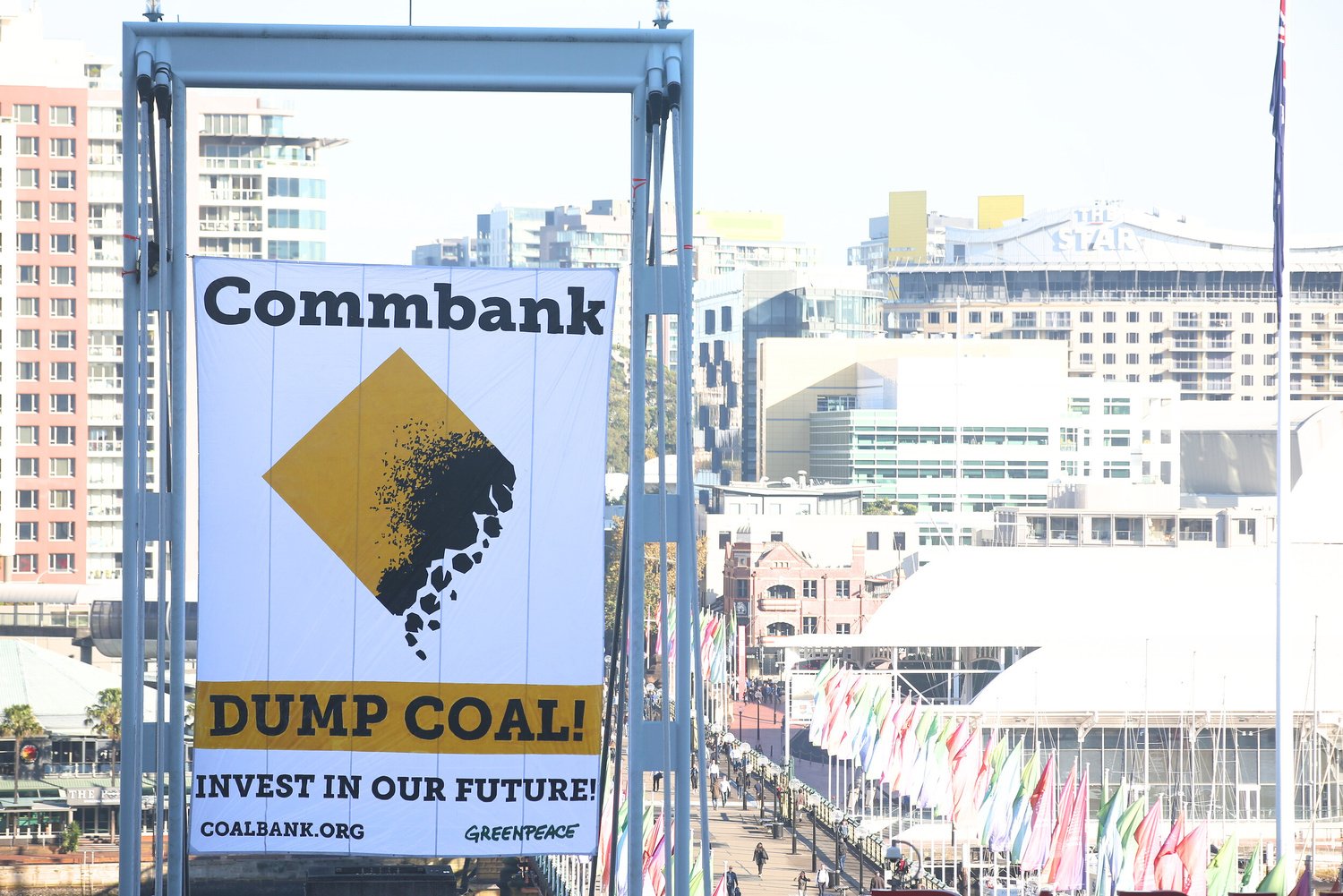
Greenpeace action in Sydney (2017) against Commonwealth Bank, demanding they Break Free from coal. © James Alcock / Greenpeace
Type hierarchy
DISPLAY HEADING
This is a heading & subheading style
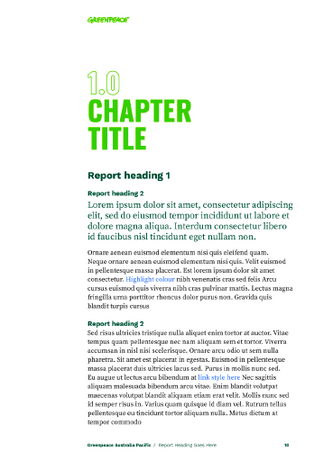
Opening paragraph text could be in Work Sans SemiBold if you want to highlight or summarise a large body of text. Atibus et magnis dis parturient montes, nascetur ridiculus
Generally, however, paragraph texts will be in Work Sans Regular. Proin nec imperdiet dolor, quis ornare neque. Fusce pulvinar dictum hendrerit. Nulla consequat non erat in fermentum. In fermentum semper arcu, nec scelerisque turpis aliquet sed. Orci varius natoque penatibus et magnis dis parturient montes, nascetur ridiculus mus. Proin necimperdiet dolor, quis ornare neque.
Secondary Subheading Style
Fusce pulvinar dictum hendrerit. Nulla consequat non erat in fermentum. In fermentum semper arcu, nec www.scelerisque.com turpis aliquet sed.Orci varius natoque penatibus et magnis dis parturient montes, nascetur ridiculus mus. Proin nec imperdiet dolor, quis ornare neque. Fusce pulvinar dictum hendrerit.
When laying out a document, type should always be clear and legible. Consistent styling whereby using a balance and variety of weights, to create pace and contrast between messaging will create a cohesive typographic system within Greenpeace communication pieces.
Display Heading
Greenpeace Sans, 40pt, uppercase
Heading/Subheading
Work Sans SemiBold, 18pt
Body copy
Work Sans SemiBold/Regular, 12pt
Secondary subheading
Work Sans SemiBold, 14pt, uppercase, kerning +100
Usage examples
Imagery
Iconic photograph or image that illustrates, brings emotion or gives context to the story.
Logo
Clearly visible & well contrasted with background colour
YOUR NEXT VICTORY STARTS HERE

From going bow to bow with fossil fuel companies, fighting deep sea mining and creating ocean sanctuaries, you can help Greenpeace stay at the helm of ocean health.
Every second breath we take comes from the ocean. Healthy oceans are the life support system for our planet, providing 97 percent of the Earth’s livable habitat and a home to more than 700,000 different species of marine life.
www.greenpeace.org.au/protecttheoceans
© Martin Katz / Greenpeace
Greenpeace Sans
Heading or title text with key word highlighted with a brushstroke graphic.
Work Sans Semibold
Subheading or key paragraph
Work Sans Regular
Body copy or summary text
URL + image credit
Work Sans font. Clearly visible & well contrasted with background colour
graphic elements
Brush strokes
Brush strokes are an optional graphic element used to highlight or emphasise key words in Titles and Headings. They should predominantly be paired with Greenpeace Sans font in uppercase.
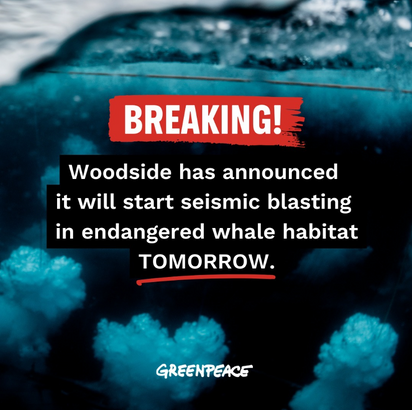
Use sparingly and always ensure enough contrast between the brushstroke colour and text colour.


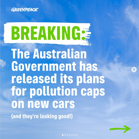
Brush stroke is used to draw attention to “BREAKING”. The green text on white is clearly legible and emotes a sense of good news.
BREAKING
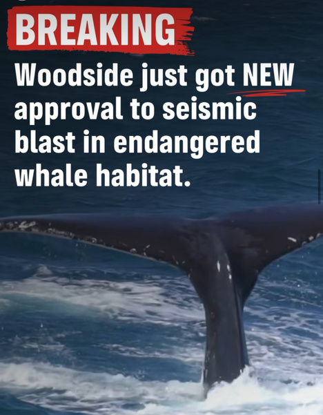
Brush stroke is again used to draw attention to “BREAKING”, with the white text on red clearly legible. The red colour contrasts well against the dark blue background image, and it gives an immediate sense of urgency and danger.
A subtle red underline of the word “NEW” helps to a draw secondary emphasis.
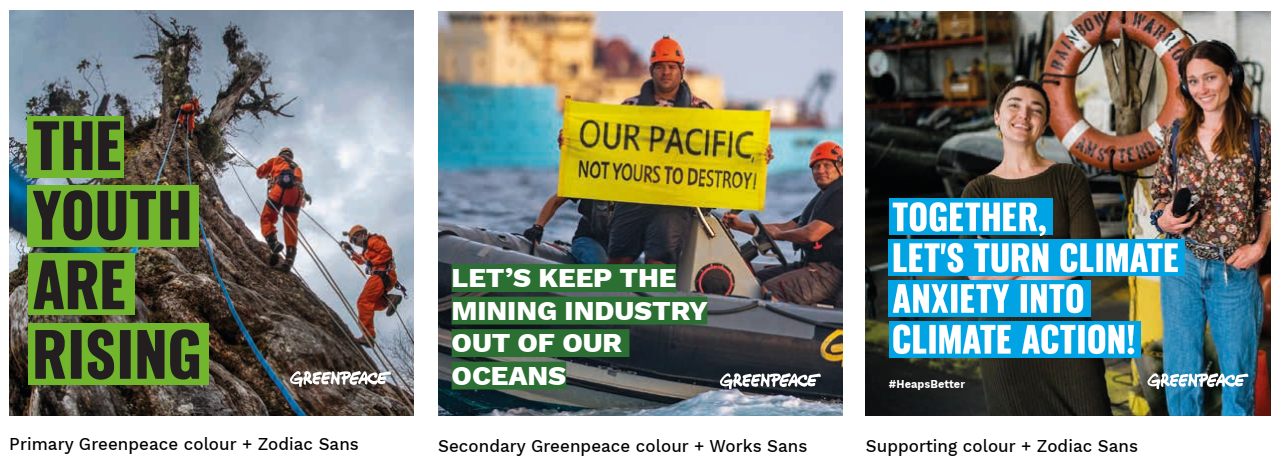
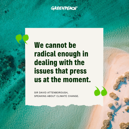
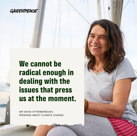
Basic text holding shapes
Holding shapes can be used for larger blocks of text, to enhance legibility against a busy image. They can be set in primary, secondary or supporting colours with either white or black text. Be sure to consider contrast for accessibility.
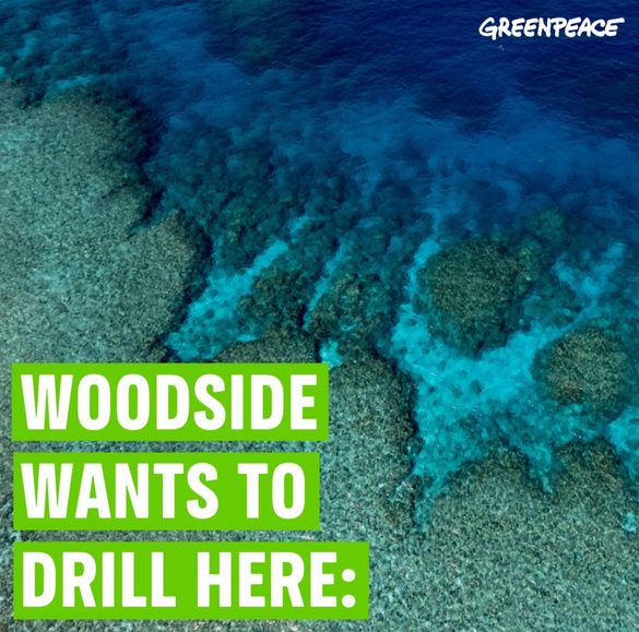
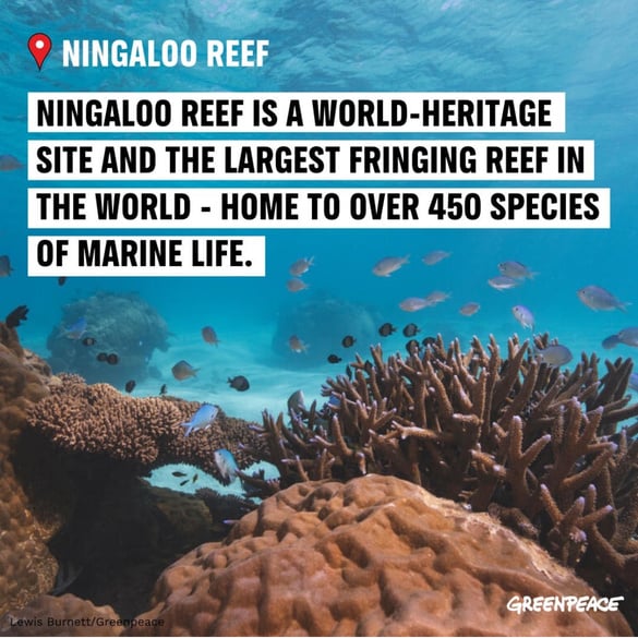
Ningaloo Reef is a world-heritage
site and the largest fringing reef in the world - home to over 450 species of marine life.
Primary Greenpeace colour + Greenpeace Sans
Secondary Greenpeace colour + Works Sans
Supporting colour + Greenpeace Sans
Underlines & embellishments
Other graphic elements may be added to draw further attention to key words in a more subtle manner. They are an optional and are to be used sparingly.


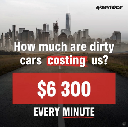
41% of all new car sales in Australia are bought for fleets
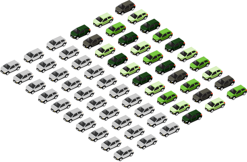
Graphic elements are used to encircle and draw attention to key statistics on the website.
The Great Barrier Reef just experienced another mass bleaching event.

Here’s what you need to know

A red underline of the word “another” helps to a draw secondary emphasis.
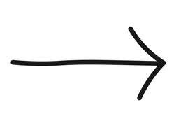
An arrow indicates more info and encourages the viewer to scroll through the slides.
Framing devices
Frame and paper tear graphics are used to:
- Create space for text
- Break up page sections
- Create a frame to hold an image or quote
- Add texture to a piece of creative

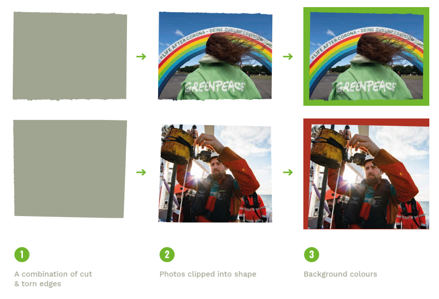
- A combination of cut & torn edges
2. Photos clipped into shape
3. Add background colours
Framing devices in use
Framing device is used to break up sections, bringing movement into the design.
Framing device is used to create space for blocks of text.
Fossil criminals should
stop drilling and start paying

It's time to hold the fossil fuel industry accountable for the loss and damage they have caused to humans and biodiversity. It's time to stop all new coal, gas and oil projects and phase out these dirty fuels forever.
Join us in this urgent fight for climate justice

SIGN THE PETITION
Framing device is used to hold an image.
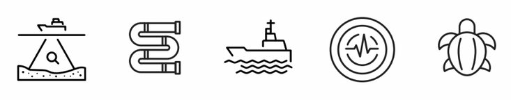
ICONS & ILLUSTRATIONS
Line icons
Our suite of line icons are symbols used to help communicate a subject or idea quickly. The icons can be used throughout various digital applications, typically in black or white.
They have been developed as a secondary support to information and should never be used as hero illustration.
Icons should always be designed at 3pt line thickness.


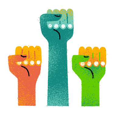
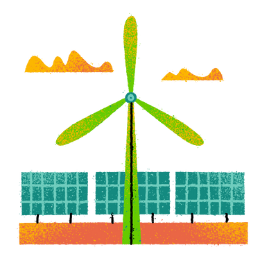
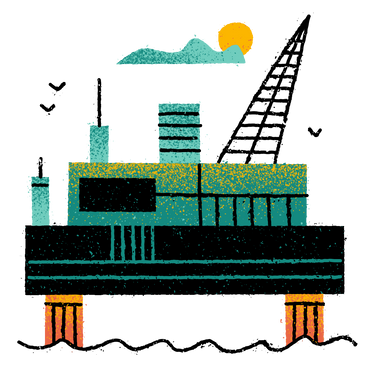
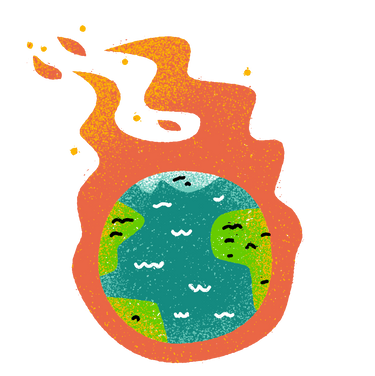
Brand illustrations
These hand drawn digital illustrations are used to visually describe our campaigns or key functions.
Feel free to use these illustrations for your social posts and website, but please note that these icons are
for usage on the website only! So, please don’t use them for print purposes, because we don’t have the license for it.


Greenpeace and the rainbow
During Greenpeace’s very first campaign in 1971, Bob Hunter was inspired by the story from the book Warriors of the Rainbow written by the Cree Indian Nation woman named Eyes of Fire.
When the earth is ravaged and the animals are dying, a new tribe of people shall come unto the earth from many colors, classes, creeds and who by their actions and deeds shall make the earth green again. They will be known as the Warriors of the Rainbow.
Since 1978 we have sailed with the Greenpeace flagship Rainbow Warrior, carrying with it the rainbow and peace dove, an integral part of our ships’ identities.
Throughout history, the rainbow has been seen as a symbol of hope, peace, connection and joy, values that Greenpeace aspires to live up to whilst remaining faithful to the original spirit of the Warriors of the Rainbow.
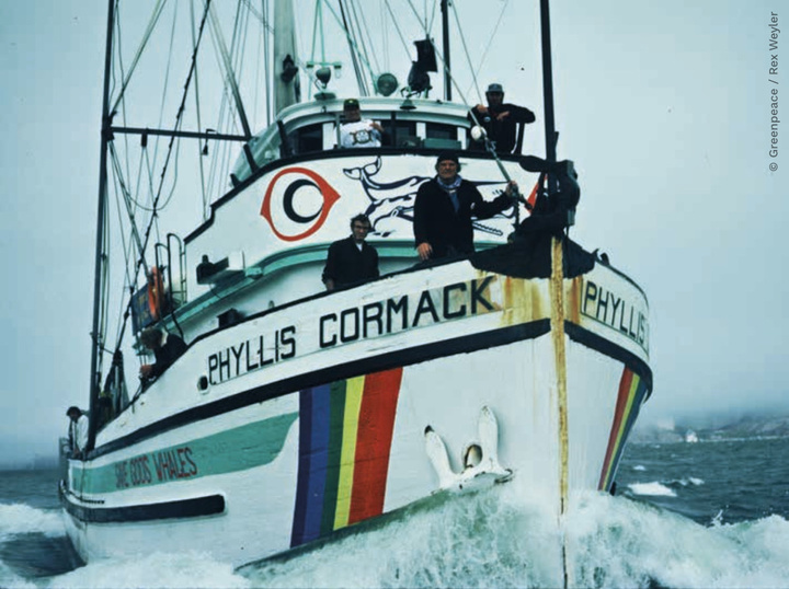
The Greenpeace rainbow on the side of the Phyllis Cormack in 1976.

Using the Rainbow as part of our identity:
Although closely linked to Greenpeace, the rainbow should not be seen as a regular identity element apart from on our ships.
Use it sparingly and thoughtfully to provide the greatest impact. We can gain guidance and inspiration from the colours of the rainbow – pure, bright and strong.

PHOTOGRAPHY, VIDEOGRAPHY
& VISUAL STORYTELLING

Visual storytelling
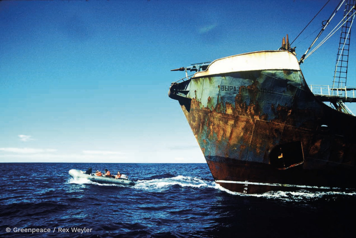
A single, powerful image has the ability to capture hearts and minds, and potentially create mind bombs. When Bob Hunter set off to move the masses on the issue of whaling in 1976, he knew exactly the image that was needed; the image of a Greenpeace zodiac in between the harpoon and the whale is as powerful and memorable today as it first was. It tells the story of right and wrong, makes you care, forces you to take sides and sums up the bravery and courage we need to do something about it.
Greenpeace activists blockade a Russian whaling ship in the North Pacific, 1976. © Greenpeace / Rex Weyler
Photo and video overview
Greenpeace imagery should engage our audiences and inspire them to take action. We should aim for clear, compelling pictures which embody elements of both our identity and our campaign work. Getting and distributing the right photos is a key component of our communications strategy.
USE OF IMAGERY
Images are one of the most powerful ways of getting our message across. To help reinforce our identity and communications strategy, we should aim to use images which are empowering, engaging and which depict solutions.
The Greenpeace Media Library is a vast collection of high quality photo and video, free for staff and external collaborators to use. To book in a Media Library induction, please reach out to the GPAP Creative Team.
Our images and video should always credit the creator.
Philippine Purse Seine Fishing Operation. © Alex Hofford / Greenpeace
Photography styles
Photography is integral to the Greenpeace brand. It helps convey the tone of the messaging whether it be urgency, hope or transparency. As well as visually communicating an idea, photography can take on many styles which serve different purposes:
HOPEFUL FUTURE
Positive, bright outlook.
These images show what we would like to protect and the future we want to see for a safer, greener planet. Wildlife and beautiful scenery images have the power to inspire audiences. These photos are breath-taking, precious and emotional. These images should awaken a response in the viewer and create an appreciation for natural beauty in a pure form. They should portray biodiversity using a variety of viewpoints followed by detailed close-ups of plants and animals.
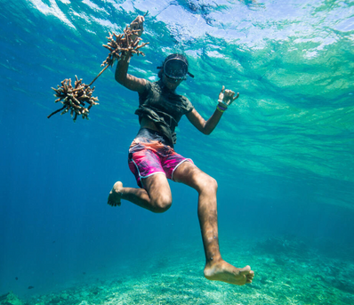
Zaridah transplants coral at the Vale Vale Bay Coral Garden in Vanuatu, a project to bring new life to the local reef, 2019.
© Arlene Bax
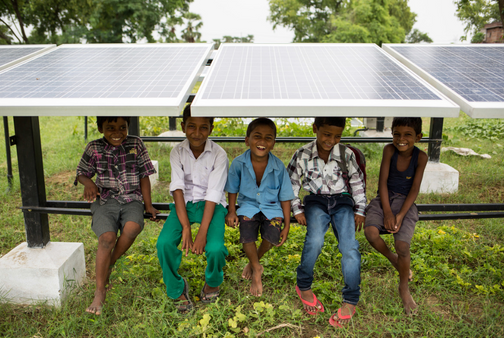
Children sit under solar panels at Bishunpur Tolla, Dharnai village. A solar-powered micro-grid is now supplying electricity to the village. © Vivek M. / Greenpeace
INVESTIGATE, EXPOSE & CONFRONT
Dynamic, transparent.
These photos bear witness and, by documenting environmental destruction, give the planet a voice. These photos depict environmental abuse, and, as a balance, include a selection of images depicting environmentally responsible and socially just solutions. The pictures should show the scale of the problem and be strong and clear, as they will be used in a variety of ways – Greenpeace reports, promotions, presentations and fundraising as well as news media and the web. Sometimes subtle branding is portrayed showing Greenpeace personnel engaged in campaign activity.
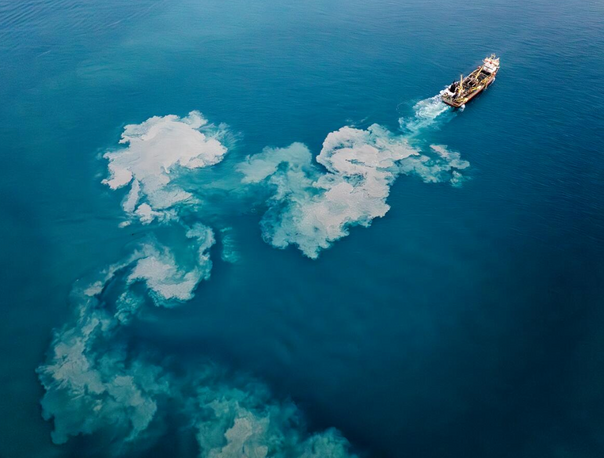
Greenpeace documents Woodside’s dredging activities in endangered sea turtle habitat for its Burrup Hub project in Australia, 2023. © Greenpeace / Alex Westover
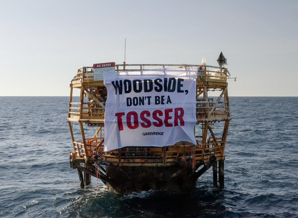
Activists occupy Woodside's discarded toxic oil tower in Australia, 2023
© Greenpeace
EDITORIAL
Authentic, reportage-style
These images offer a different perspective by looking at an issue through the eyes of those directly affected, using their words to tell the story. These feature stylised photos that reveal the story behind the hard news. Text and image may run over several pages and explore different angles in depth.
CAMPAIGNS
Dynamic, urgent, cheeky.
These images document Greenpeace taking action and communicate campaign issues. These photos aim to convey the narrative in one shot; they demand attention and act as an opening into the story. Clear and complementary captions including people, locations and date help to complete the story. When showcasing our wins, we should use imagery that clearly shows activists making a difference.
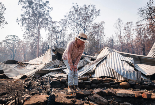
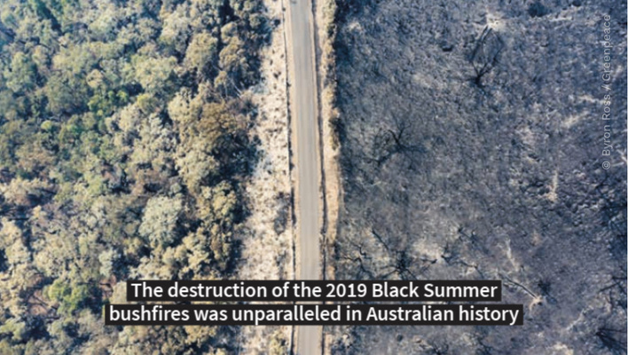
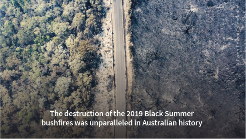
Bushfire survivor Melinda Plesman inspects the damage to her property at Nymboida southwest of Grafton in NSW, 2019. © Natasha Ferguson / Greenpeace
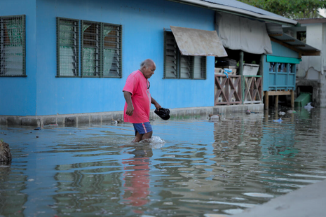
King Tide Aftermath in Funafuti, Tuvalu, 2023. © Greenpeace / De'allande Pedro
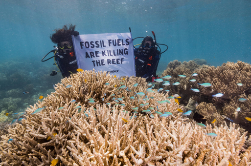
Divers with Sign Underwater on the Great Barrier Reef in Australia, 2022. © Greenpeace / Grumpy Turtle / Harriet Spark
BIODIVERSITY
Awe-inspiring, emotive.
Breathtaking wildlife images inspire our supporters to take action. The most powerful, emotive images are images of animals with direct eye contact. Images of baby animals are also a powerful trigger. These images work well juxtaposed with the imminent danger posed by destruction of their habitat.
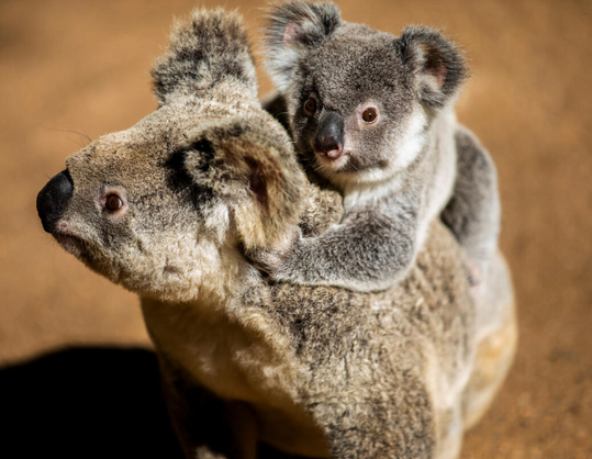
Koala and her joey in Australia, 2020. © Paul Hilton / Earth Tree Images
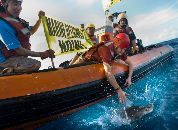
Activists free a turtle from a hook of a longliner in the Pacific, 2008. © Greenpeace/Paul Hilton
Do’s and Don’ts
IN A NUTSHELL
Use sharp imagery that clearly illustrates a purpose, threat, or victory. The subject of the image should be distinct and straightforward. Choose impactful images that contribute to communicating the message.
USE PORTRAITS
Showing the people on the frontline of climate activism and environmental impact is essential. Show the faces behind our name. Choose close-up shots of people – making eye contact if possible – and use the headline or caption to put them in context. Make it real, not staged.
INCLUDE EVERYONE
When you can, show all genders, different ethnicities and age groups. This won’t be possible in every single photo, but as a set our photos should reflect how massive and diverse our movement is.
SHOW IT’S CLEARLY US
When you can, use images of people who have a Greenpeace logo on them so we can’t be mistaken for anyone else.
USE COLOUR
Always use colour photography when possible; images should be attention-grabbing and illustrate real people, beauty or threats.
DISTORTION + MANIPULATION
Never distort images to make them look more dramatic than they really are.
BLURRY/OBSTRUCTED IMAGERY
Use images that are clear and not pixellated.
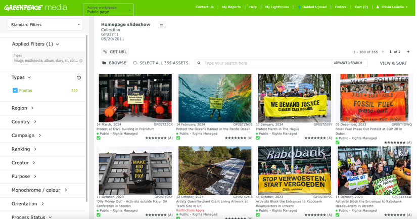
Greenpeace Media Library
The Greenpeace Media Library is an accessible and exhaustive archive of Greenpeace photo, video and multimedia materials from around the world since 1971, that is catalogued and rights managed.
Our Media Library also provides professional media sharing capabilities for current activities, allowing proper and easy distribution of materials to external users. The Creative Team manages the upload, cataloguing and distribution of these materials for the Greenpeace Australia Pacific region.
How to use it
Staff and external users can create a free login to enable tools like lightboxes and internal searches. The Creative Team regularly runs compulsory induction trainings for new staff members, and can provide upgrades to accounts to enable automatic download.

User Name
Consent & appropriate use of imagery
We should always endeavour to accurately represent the environment and people in their reality, and with integrity. We strive to empower them by showing agency and resilience. Avoid stereotypes and representing people as 'victims'.
Images of people require special attention and we should ensure that we have permission from the subject/s to use their image, particularly for fundraising. The legal accountability for rightful usage is with the Greenpeace NRO that commissioned the image.
See the GPAP Creative Team for consent form templates.
Bushfire survivor Melinda Plesman delivers the remains of her home, burnt down by bushfires, to Parliament House in Canberra, 2019. © Dean Sewell / Greenpeace
Credits and captions
Images should always be credited using the Media Library crediting guidelines. Captions provide context and will help image users produce accessible and effective supporting info (i.e. press release or website article), please check that the image/video is captioned with the following:
Greenpeace credit
Photographer/Videographer credit
Context (eg. what/who*, why, date, place)
Creative Commons license if applicable
When captioning content, it's important we remain credible and accurate. We never make anything up – if in doubt, leave it out.
*Personal names (rather than generic descriptions) should always be used unless there is a security or other reason not to.
Social Media crediting guidelines [COMING SOON]
Greenpeace staff Abi and Charlene in front of 'Making Oil History' Banner in Adelaide, 2018. © Greenpeace / Alana Holmberg
AI Generated Content
Please avoid using AI generated content unless there is a strong, strategic reason for doing so. (ie envisioning a better future which we can’t currently show)
Greenpeace is reliant on trust in our brand - and any misleading visuals could damage our reputation.
If using AI, make sure it is clearly stated and attribute AI in the following format; Accountable Human/AI used/Greenpeace.
Make sure the attribution is visible;
- in the corner of the frame
- machine readable in the metadata
(See guidance on generative AI for photo/video on page 22)
BRAND COLLATERAL
& PRINTING MATERIAL
Banners and signage
The Greenpeace logo must appear in all of our campaign products to ensure accountability, transparency and recognition.
This applies to both Greenpeace-led campaigns as well as campaigns where we play a supporting or partnering role.
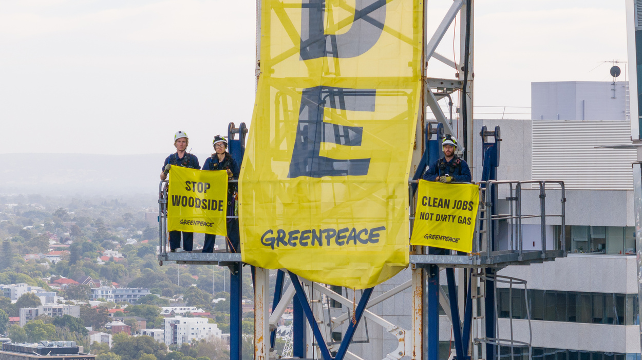
Greenpeace activists scale a 140m crane outside fossil fuel giant Woodside’s HQ. Perth, Western Australia 2023. © Greenpeace
EXCEPTION
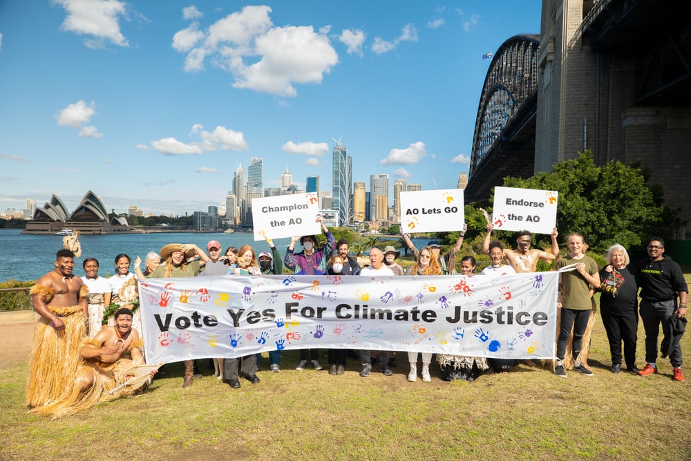
Greenpeace Australia Pacific celebrates a 'week of action' to stand in solidarity with other Youth and Civil Society Organisations from the Pacific and around the world, that are taking the world’s biggest problem to the world’s highest court.
Sydney, Australia, 2022. © Kim Nguyen / Greenpeace
DIGITAL CONTENT
PRODUCTION
Video Overview
Video guidelines can be found in the comms wiki.
Basic tips to consider
- Viewer's often don't make it to the endcard so include the Greenpeace identity early, for example by showing the Greenpeace logo in full during video title, or G bug in a corner of the screen throughout.
- Be prepared to shoot for multiple formats including vertical depending platform and device preferences.
- Will it need to work with sound off?
- Prepare good thumbnails to shows clearly what your video is about.
- Ensure you add a warning at the start if there is flashing or disturbing imagery or for culturally sensitive considerations (eg. may contain images of deceased persons)
- For social media videos make sure your end screen is not blank – this is a good place to add the logo and a call to action.
- Both owned and externally sourced footage needs to be cleared for your intended use - noting the Indigenous people and Allyship guidelines.
- Recommended video length depends on channel and how interesting your content is to your audience (remember the hook in the first few seconds).
- Wherever possible get plenty of clean shots of a target/company without activists or banners for useful longer term B-Roll.
Text on videos
- When including text, less is best. Allow time for the audience to process what's on screen. Read it slowly and clearly, out loud, as a test. For English, a good guide is a maximum of 14 words on screen at one time.
- Ensure text is large enough to be read easily (especially if it may be viewed on mobile).
- Keep transitions and animations of text simple.
- Check your captioning readability, contrast and transcripts (check automated ones).
- Add subtitles to all social media videos and produce .srt files as standard for accessibility and translation.
- Observe safe guides (provided in editing software) to allow for different viewing requirements (e.g. IGTV TV is 16:9 while teasers in feeds are 4:5)
1920 x 1080 (16:9) horizontal
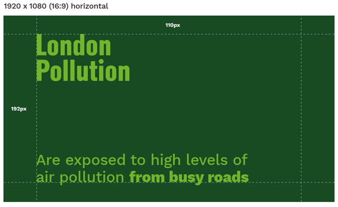
To ensure consistency and avoid cropping, it is recommended that all video text remain inside the editing software's defined safe zones.
Testing
Always check the completed work to see how the audience will view it.
- How does it look on a mobile phone - is the text readable?
- Are the interviewees easy to hear?
- Does it work with sound off?
Keep it clean and share!
Try to maximise potential for global offices to use and re-use your content. So, if possible, export (clean) versions without text on screen and without voice over, and square, landscape and portrait versions (if appropriate) along with SRT files for translation. If you have a selection of interesting shots which didn’t make the final cut, please consider also producing a clipreel so the footage can be repurposed in other productions.
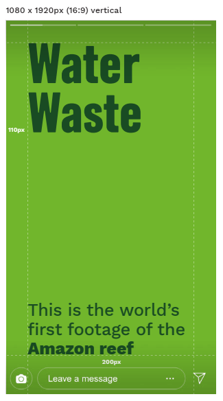
1920 x 1080 (16:9) vertical
Fonts and text styling for videos
Adding text to video work can enhance the content and add more context to the piece. Generally, we use Greenpeace Sans for titles and headings, and Work Sans Regular for everything else (subheadings, captions, end credits). See some examples below:
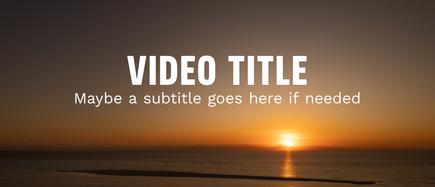
VIDEO TITLE
A subheading or a
tagline might go here
Video title
- Heading - Greenpeace Sans, upper case
- Subheading - Work Sans Regular
- Placement - centred
Lorem ipsum dolor sit amet, consectetur adipiscing elit, sed do eiusmod tempor incididunt ut labore et dolore magna aliqua.
Captions/Subtitles
- Work Sans Regular
- Placement - centred, over 1-2 lines
- Add black background block at 50% opacity, if required
Richard George
Greenpeace Campaigner
Speaker title cards
- Speaker Name - Greenpeace Sans
- Title - Work Sans Regular
- Placement - Any corner, left or right aligned, allowing space for captions down bottom.
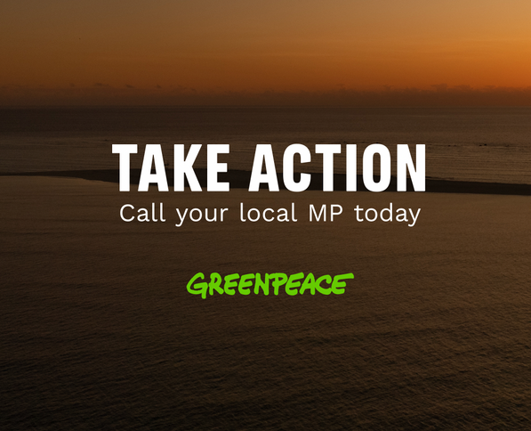
TAKE ACTION
Share this video today
CTA/End cards
- Greenpeace Sans for short punchy CTAs (~2-5 words). Add brushstroke behind if required for legibility or emphasis.
- If longer or need context, add a subheading in Work Sans Regular below. Also used for links / URLs / "Link in bio"
- Greenpeace logo
Subtitles
Subtitles styles must contrast highly with video content to be clearly legibile
Work Sans Regular
Max characters per line: 50
Recommended font size: 62pt (@ 1080p)
Max number of lines per screen: 2
Aligned – bottom centre
Default subtitle
Alternate subtitle style example (background gradient + white text).
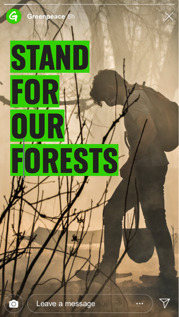
Social media - stories
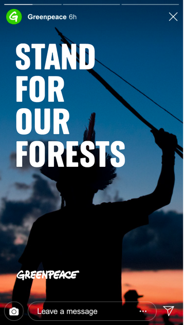
Where contrast isn’t an issue, large statements can be placed directly on images in a single colour
© Christian Braga / MNI
Where contrast is an issue, coloured holding shapes should be used behind the text to make legible.
© Eduardo Bodiño / Greenpeace
When stories are shared, the account is always referenced, so the GP logo is optional.
Logo required?
(15% – 30% page width)
When adding text or captions in-app, we are often limited with the few that are offered by the platform. Choose fonts that are sans serif - as visually close as possible to our brand fonts - and ensure clear legibility by adding background block colours if needed.
IN-APP TEXT AND CAPTIONING ON SOCIAL MEDIA
Social media - sharable posts
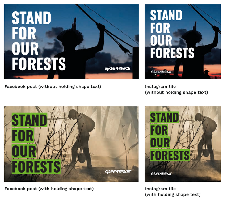
Facebook post (without holding shape text)
Instagram tile (without holding shape text)
Facebook post (without holding shape text)
Instagram tile (without holding shape text)
Posts that are designed to be re-shared should always include the GP logo for recognition and accountability.
Logo required?
(15% – 30% page width)
Sound Quality
Sound quality is important not just for radio and podcasts but also in videos - fuzzy images with good sound can be forgiven whereas great images with fuzzy sound are much harder to engage with.
Recording
Minimise ambient sounds – eg. aircon, low level humming, fridges, office noises, traffic, even birds chirping.
Use the right recording equipment, investing in the correct microphones for different situations.
Use headphones when you are recording to monitor levels and keep the input volume in the safe green zone.
Invest in good voiceover talent, hiring a professional voice artist or train up internal talent using the plentiful resources available.
Post-production
Keep music & sound effects simple. Both can be powerful tools but they can also overwhelm a production. Also remember that many people view with sound off. As with images, be mindful of music rights and stick to royalty free where possible. List of music stock libraries here
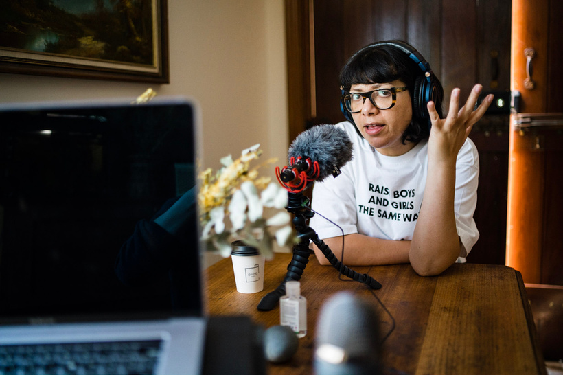
Deputy Lord Mayor of Sydney, Jess Scully, is interviewed for Greenpeace Australia Pacific’s podcast ‘Heaps Better’, 2020.
© Ash Berdebes
CAMPAIGNS +
COLLABORATIONS
Campaigns
Visual elements of our campaigns are critical to connect meaningfully with audiences and ensure maximum impact and engagement. They manifest Greenpeace’s values and purpose through design processes and outcomes.
This strategic approach is an extension of Greenpeace’s efforts to refit itself for 21st century campaigning through ground-breaking initiatives like The Framework and the Storytelling project. These guides help build a strong relationship between the global network of Greenpeace organisations and our campaigns, wherever they are in the world.
See the latest GPAP Three Year Plan for our current program of campaigns.
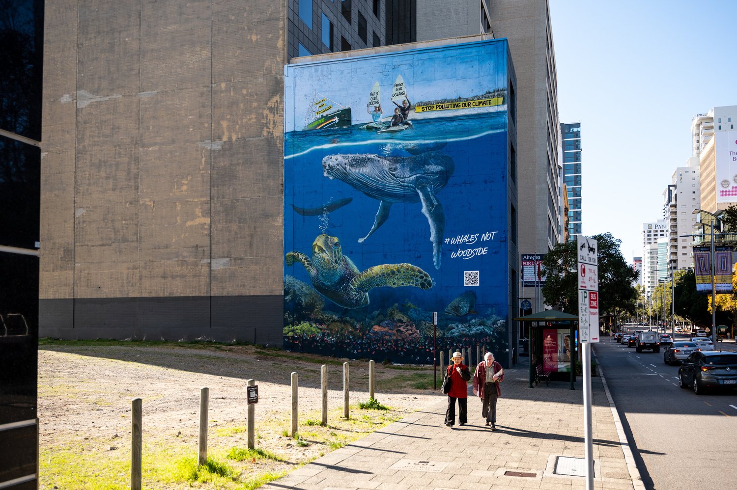
Giant #WhalesNotWoodside Mural near Woodside's HQ in Perth, WA, 2023. © Jed Lyall
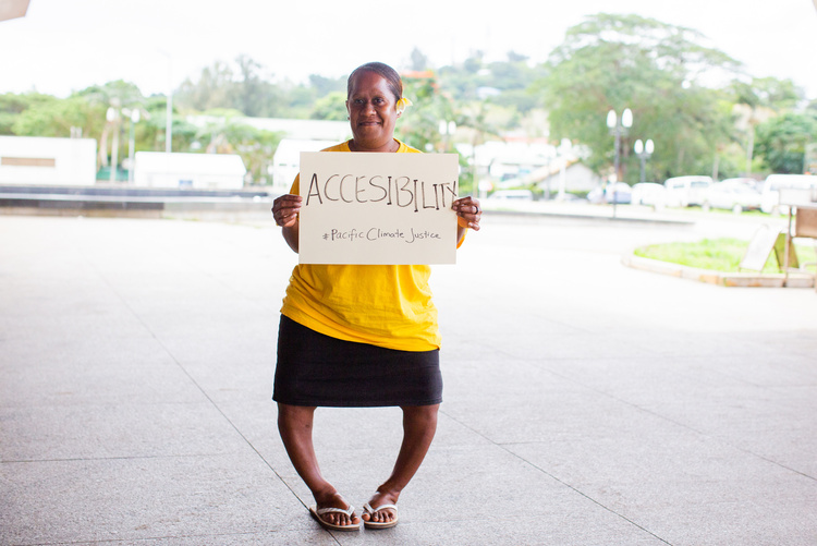
Diversity and inclusion
Greenpeace is a multi-faceted and diverse network.
We communicate with millions of people every single day. This comes with the great responsibility to not only be conscious of existing discriminatory practices but also proactively promote and celebrate equity and diversity through our visual communications.
We must continue to authentically engage with a multitude of voices, share their unique stories far and wide – particularly from those who have been systematically excluded, stereotyped, marginalised or silenced.
We have the opportunity in all of our communications to champion this diversity by creating visuals that are
inclusive of race, ethnicity, gender, sexual orientation, age, faith, language, location, accessibility, and socioeconomic status. With the choices we make with our visual language, we can take a step forward to dismantle the existing systems of injustice and inequality. For more resources, see guidelines on equity, diversity and inclusion.
1
© Harriet Spark / Grumpy Turtle Film / Greenpeace
3
Greenpeace / Michaela Skovranova
2
© Arlene Bax / Greenpeace
4
© Manny Perez / Greenpeace
5
© Greenpeace / James Alcock
6
© Greenpeace / Island Roots
1. Rainbow Warrior Crew Welcomed to Country by Traditional Owners in Albany.
2. Winnie, a disability advocate in her community in Vanuatu and leader in the climate movement.
3. Children Visit the Rainbow Warrior in Broome, Australia.
4. Greenpeace volunteers and staff march in the LGBTIQA+ Mardi Gras parade in Sydney, Australia.
5. Greenpeace Defends Independence of Environment Groups in Australia
6. Youth activist Anjali Sharma and local community members during a visit in Vanuatu.
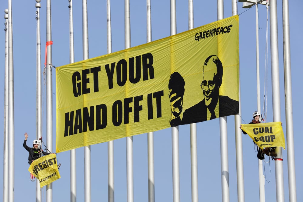
Brand Attacks
Brand attacks are a form of culture-jamming used to parody corporations and hold them to account. It often involves taking the visual assets of a brand* (e.g. logo, packaging, signage) and editing or re-imagining the content to expose hidden agendas or unethical practices.
Accountability
When mounting a brand attack, it is important that we remain accountable by ensuring our logo appears somewhere in the brand attack communications material. It doesn’t have to be dominant every time, but the public should always be able to connect the campaign with the responsible Greenpeace organisation.
Always undertake a legal check before using parodied logos as part of a brand attack.
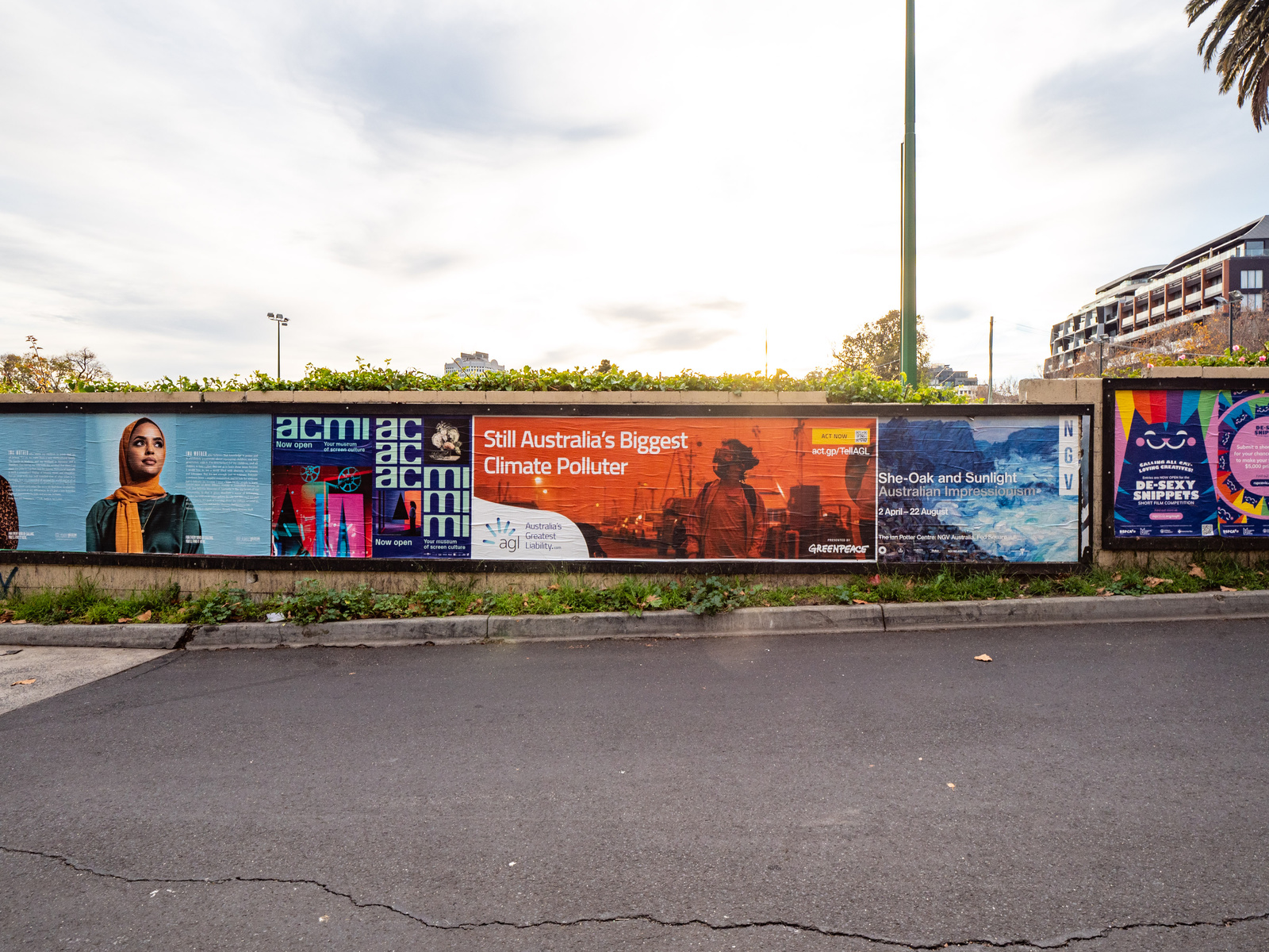
Greenpeace launch a brand attack on energy provide AGL, with guerilla street posters distributed across Australia. AGL’s tagline was reimagine as ‘Australia’s Greatest Liability’. 2021.
© Greenpeace
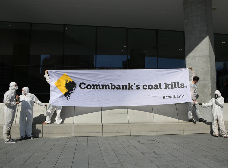
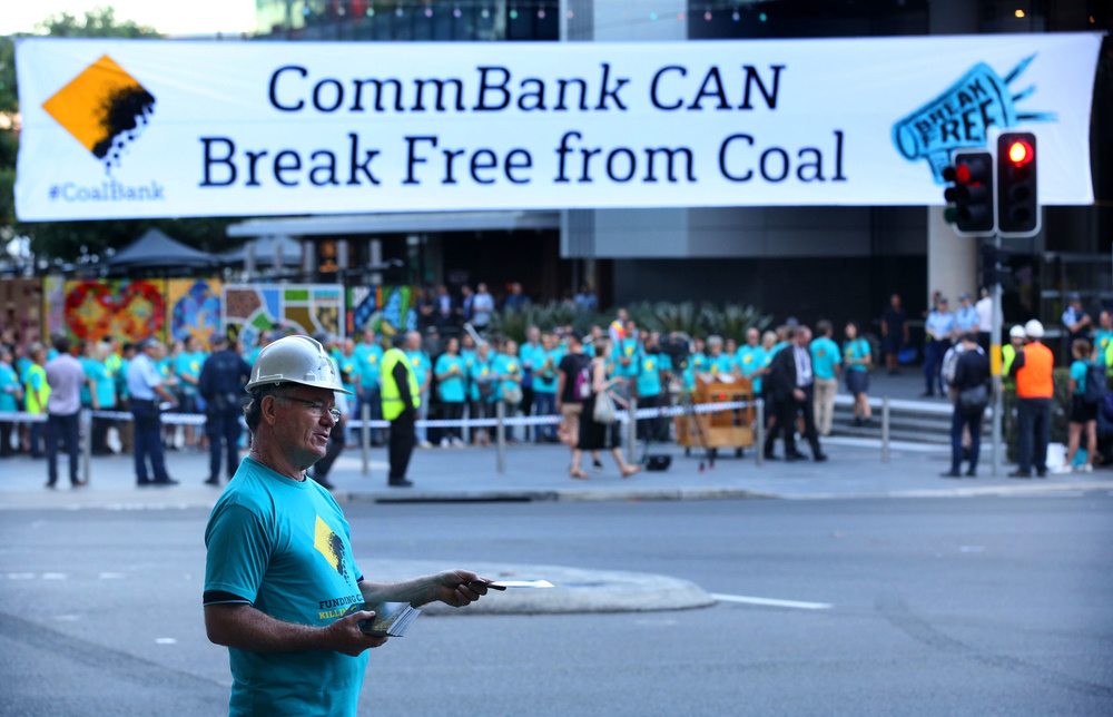
Action against Coal outside Commonwealth Bank's Annual General Meeting (AGM) in Sydney, 2017.
© James Alcock / Greenpeace
Working with external providers
Invest in your brief
Proper briefing ensures that the expectations and purpose of the assignment is clear, key information provided and that formats and protocols are followed. Work with the Creative Team to All this is agreed by both the commissioning parties and the creators.
Stock libraries
Stock libraries can be useful for images that are not commonly found within the Greenpeace archive. It’s important to note that ensuring legal usage is the responsibility of the user (you) so ensure that rights are clear, especially recognisable images of people. It is recommended we obtain a licence on materials we might want to reuse.
Working with external talent and creative agencies
The ever increasing demand for content and fresh perspectives may require us to work with external partners. Key points:
- Ensure that there is a non-disclosure agreement signed before providing any access to campaign materials. NDA model agreements here.
- Ensure that identity guidelines and access to our diversity inclusion policy have been provided.
- Where possible, ensure contracts allow for global distribution with exclusive unlimited reproduction rights.
- Thoroughly explain our values and objectives.
- Whether it’s pro-bono or paid, we need to have a clear agreement on how the external providers may use materials, e.g. using it for self promotion may influence our perceived independence.
- We maintain the right to not use the final materials.
- Check the background of external partners to ensure they do not have vested interests with campaign targets.
- Metadata should remain with images (*note for security concerns).
Illustrations, Animations & Infographics
Illustrations
Illustrations can be a powerful and evocative way to convey a message.
Consider using illustrations when:
- A particular subject lends itself to an illustrative approach (non-literal, metaphoric, etc.).
- There is a lack of good quality images that can communicate an issue.
- Your audience may be more receptive to an illustrative approach.
Collaborate with and commission local artists for local issues. Ensure contracts allow for global distribution with exclusive unlimited reproduction rights. As with Photographers, credit illustrators in your output as per licensing agreement, and the creative may be uploaded to the media library.
Infographics / data stories
Providing well considered visualisations can make complex or dull data into persuasive and impactful communication tools. The key is to find the most important information and construct a visual story that your audience can relate to by using images, words and framing they understand and sparks their curiosity.
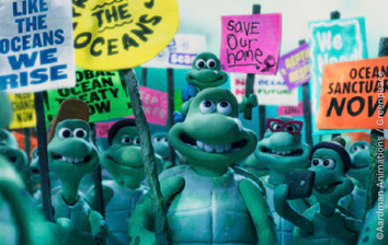
Above: 'Turtle Journey' produced by Aardman Animations and Greenpeace UK.
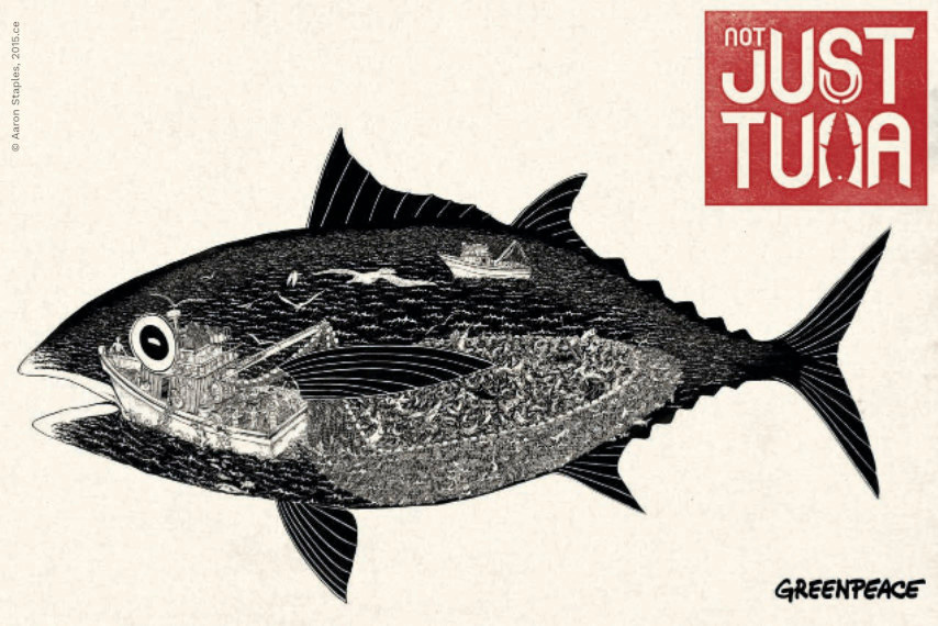
Not Just Tuna Greenpeace campaign Illustration
Legals
Request a legal review if materials contain any of the aspects listed below:
- Statements that could harm the reputation of individuals, companies, NGOs or other entities. This includes factual statements (e.g., an accusation of illegal conduct), but also strongly worded opinions (e.g., an accusation of hypocrisy)
- Statements of any kind about past, current, or potential opponents in litigation, or about Greenpeace staff involved in legal procedures
- Sensitive information regarding Greenpeace activities (e.g. future actions) or sensitive information leaked from a company or public body (e.g. details of a nuclear waste transport)
- Trademarks (company names, brands, logos), copyrighted works (all texts, video or still images, maps, designs or graphics, music, web pages, computer programs etc. not created by Greenpeace itself) and parodies thereof. This also includes intellectual property not necessarily belonging to the ‘target’
- Personal data (e.g. names, photos, or other identifying information of supporters), especially if we have not received specific consent for the publication
Communications leads are responsible for determining whether a legal check is necessary.
If in doubt, ask the Head of Communications and Investigations or Head of Program Engagement.
*The GPI Legal Unit may always be consulted on communications if NRO counsel is not available. If legally risky material will be posted on GPI channels, it must first undergo legal review by the GPI Legal Unit.